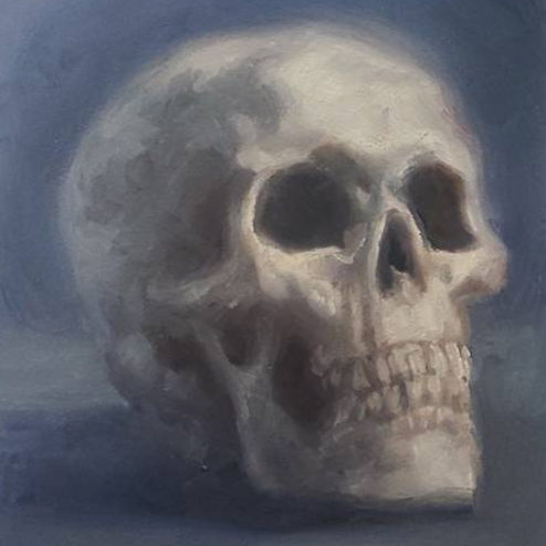
Cool White and Warm White
Painting Light
Cool White and Warm White are formulated for painters who want to factor the color of the light into their color mixtures. The color of the light source influences all of the other colors in the painting’s subject matter. Using a white that replicates the temperature of your light can create a consistent quality of light and color harmony throughout your painting.
When to use Cool White or Warm White (vs. Titanium White)
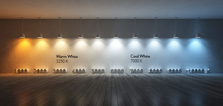
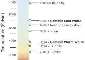
Cool White and Warm White are perfect for painters working in warm and cool light situations, respectively – mimicking the warm light at sunset or the cooler light of mid-day or a north light studio. The graphic below illustrates how the temperature of light changes throughout the day, as well as plots our Cool White and Warm White within this spectrum. In warm light situations, highlights are warm and shadows become cooler. The opposite happens in cool light situations, where highlights are cool and shadows are warmer by comparison.
Formula
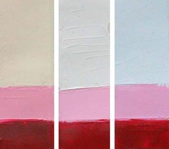
Based on our Titanium Zinc White formula, these whites have a perfect balance of yellow, orange and blue pigments to lighten and warm/cool other colors, while maintaining their hue.
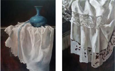
The painting below on the left is dominated by the blue of the vase and similar cool hues weave their way throughout the shadows of the fabric. Deborah balances these cool shadows with warmer areas of light using the Warm White.
