Which black oil color should I paint with?
Black is the product of fire. Color in the absence of light. Black is also the color of mystery, mourning, and Johnny Cash.
Why use black in a painting?
Simply put, no other color quickly or effectively creates shades as black. However, the strong mixing strength and/or temperature of some blacks can be difficult to control in nuanced color-mixing. Just as we have different whites in our Artists Grade line of oil colors, we offer six different blacks, each with their own unique characteristics. The relative opacity or transparency, tinting strength, and color temperature of a black all influence how it will behave on our palettes and in our paintings.
For this run-down of our different blacks, we’re including both Van Dyke Brown and Payne’s Gray as their temperature biases factor importantly into the discussion.
Ivory Black
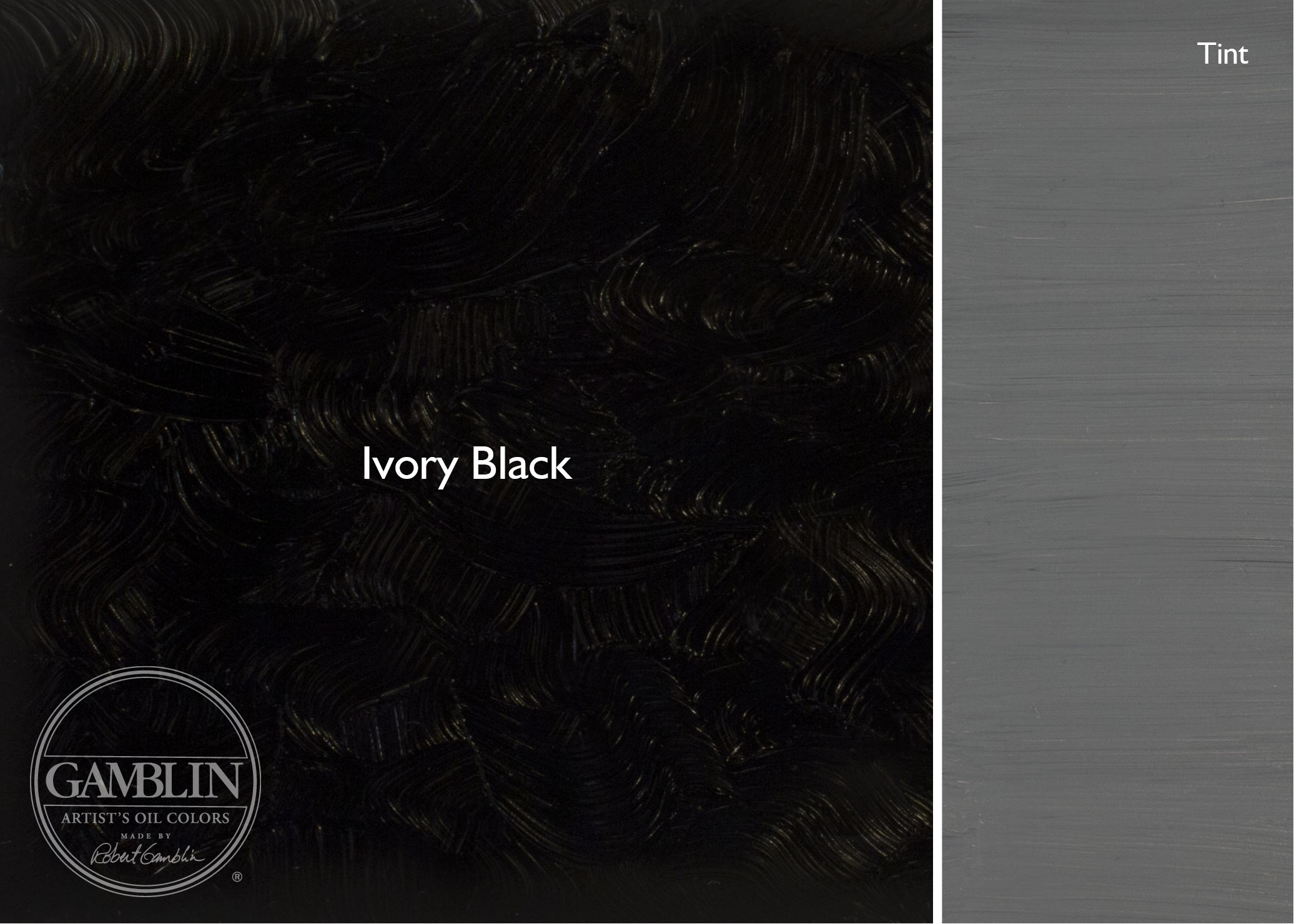
We’ll start with the most widely-used black. Ivory Black is made from burnt bone (which is why it is sometimes called Bone Black).
Ivory Black is semi-transparent. It has a moderate tinting strength, so it doesn’t overwhelm mixtures, making it a good all-around mixing black. If you like Ivory Black, but find that it dulls mixtures a bit too much, consider Chromatic Black.
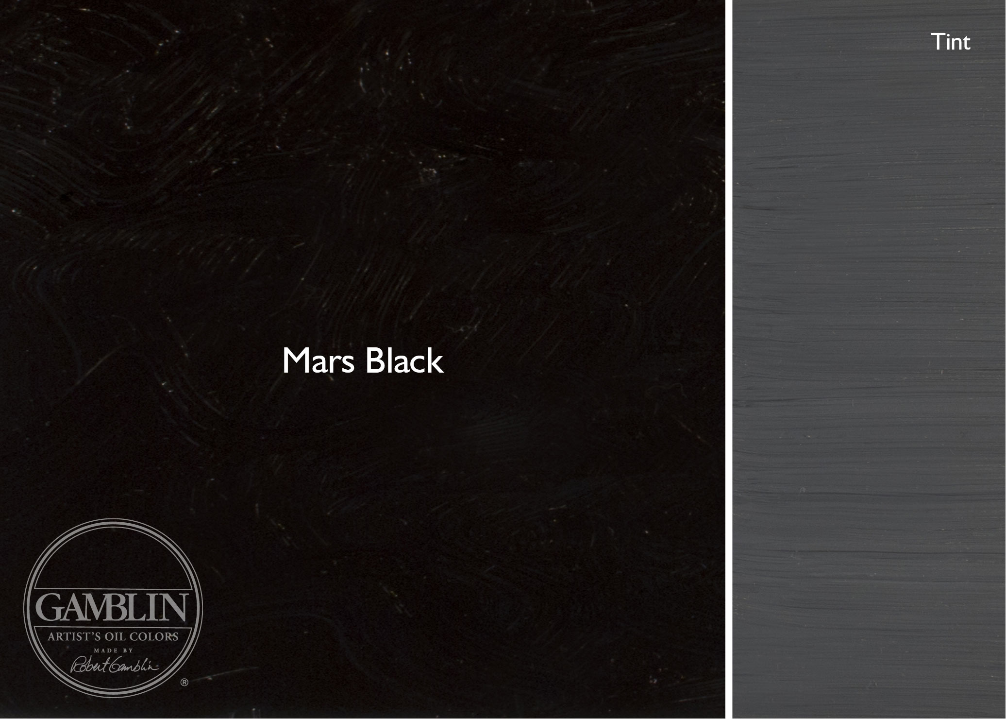
Mars Black
Mars Black is a synthetic iron oxide, and like other Mars colors, it is very opaque. It has a very strong tinting strength, making it a bit overwhelming in color mixtures. Mars Black is useful when you want to use a strong, opaque black in your paintings straight from the tube (think Franz Kline or the German Expressionists).
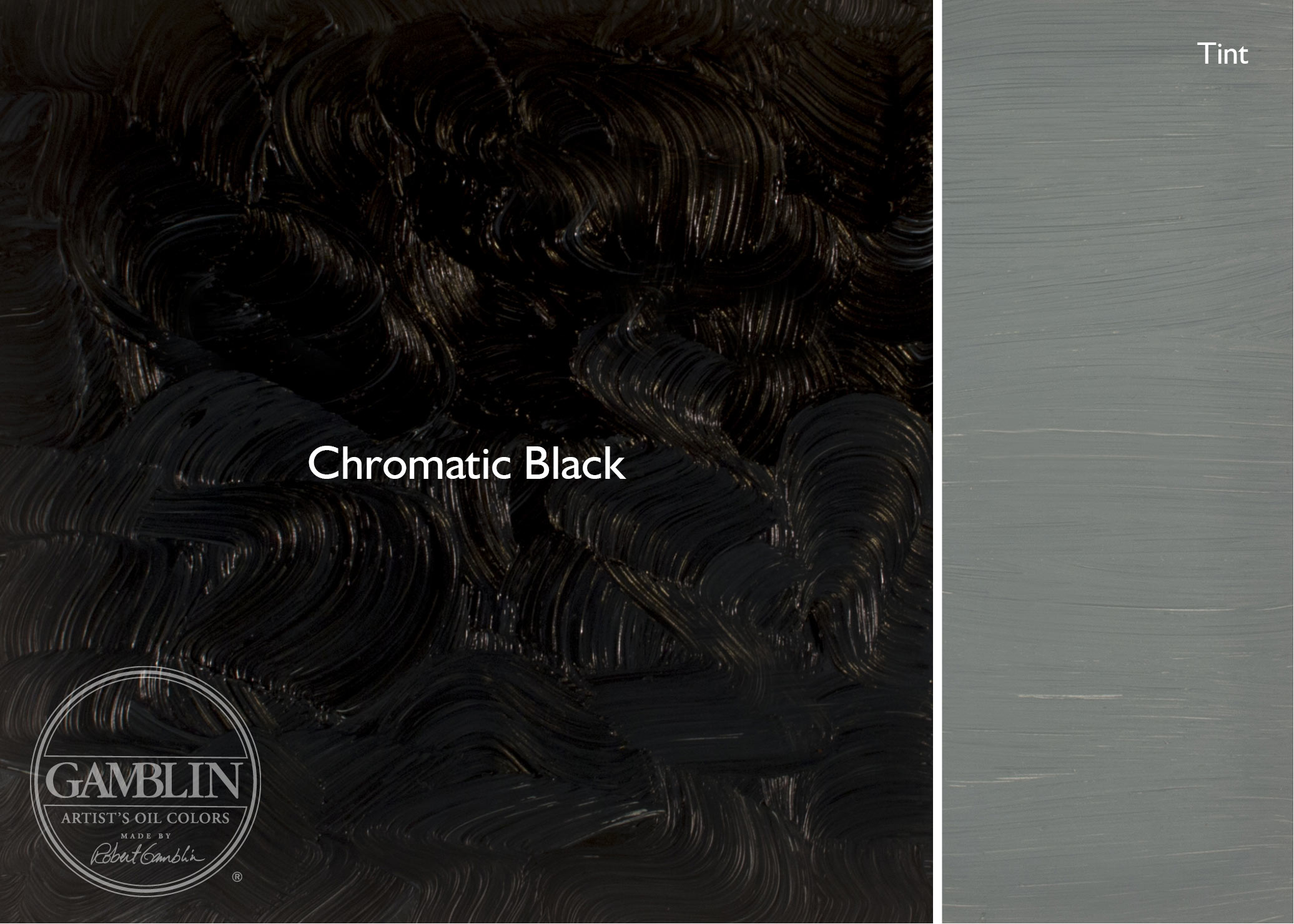
Chromatic Black
Developed by Robert Gamblin, Chromatic Black is unique to Gamblin.
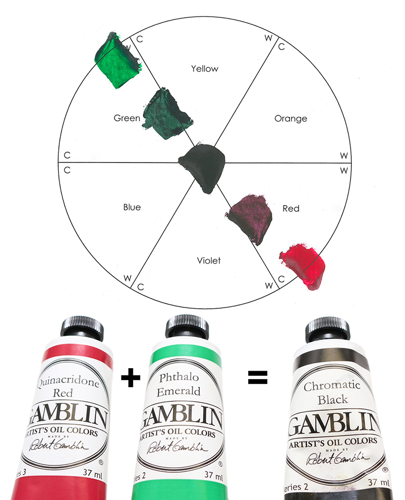
For some painters, the use of black straight-from-a-tube has been discouraged. And as an alternative to a tubed black, many painters choose to mix their own blacks. There are a number of really good combinations for this: Burnt Sienna and Ultramarine Blue, Sap Green and Alizarin Crimson are examples. Chromatic Black was developed in this spirit of a mixed black. Chromatic Black is made by mixing two modern organic colors that we’ve found to be perfect complements: Phthalo Emerald, a warm green, and Quinacridone red which is a cool red.
These two colors when mixed together pass right through that middle section of the color wheel to produce a really deep, rich black, perfect for creating cleaner shades of colors. Because of its transparency, it is the blackest or darkest black on the color palette and it’s ideal for mixing with other transparent colors when you don’t want to give up their transparency. Consider Chromatic Black if you want a black with some life to it that’s also more subtle in mixtures.
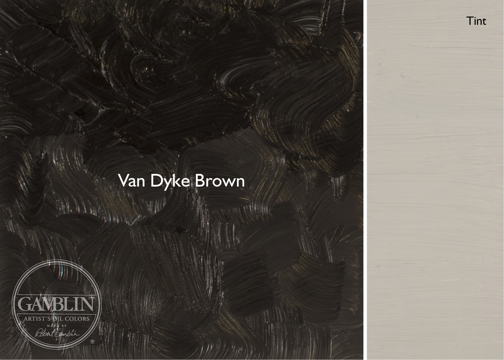
Van Dyke Brown
Van Dyke Brown is a contemporary permanent version of the historical color and it is one that we consider to be the warmest black on the palette. Its formula includes some iron oxide in the mix, which contributes to its warmth. Van Dyke Brown is semi-transparent. Consider Van Dyke Brown for creating shades of skin tones.
Payne’s Grey
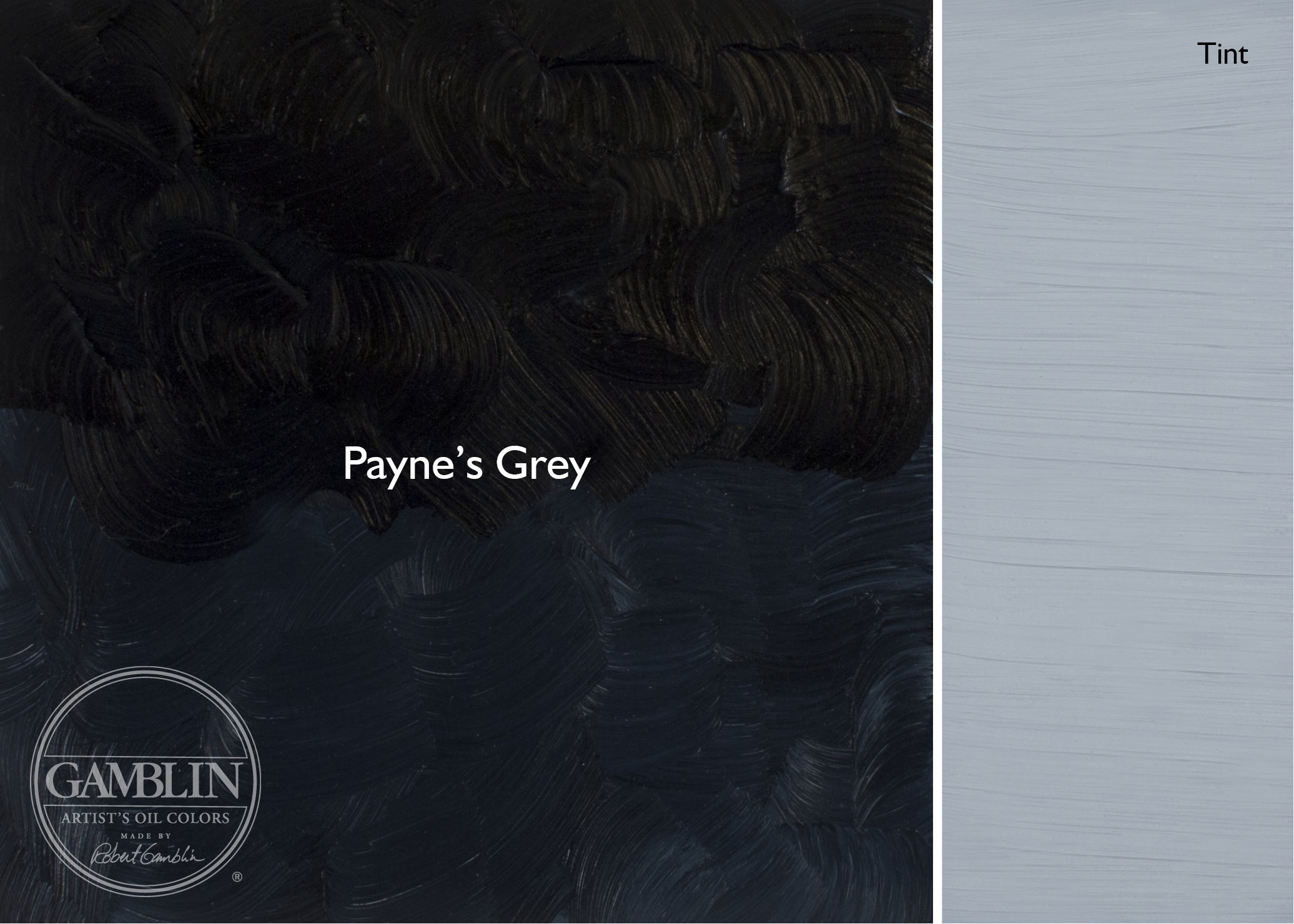
Payne’s Grey with a touch of white creates the color of storm clouds and the last color mixed before plein air painters take shelter. Payne’s Grey is the coolest black on the palette, due to the Ultramarine Blue in its formula. Payne’s Grey is semi-transparent. If capturing the coolness of shadows is an important consideration in your work, consider shading colors with Payne’s Grey.
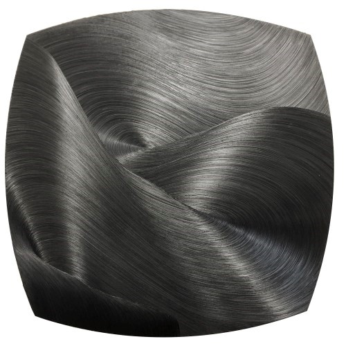
All the Stars in the Sky, Oil on canvas, 60″x 60″, 152 x 152cm
Related Posts:
Neutral Greys: Portland Grey Light, Portland Grey Medium, and Portland Grey Deep
[helpful]

