Vibrant. Subtle. Harmonious.
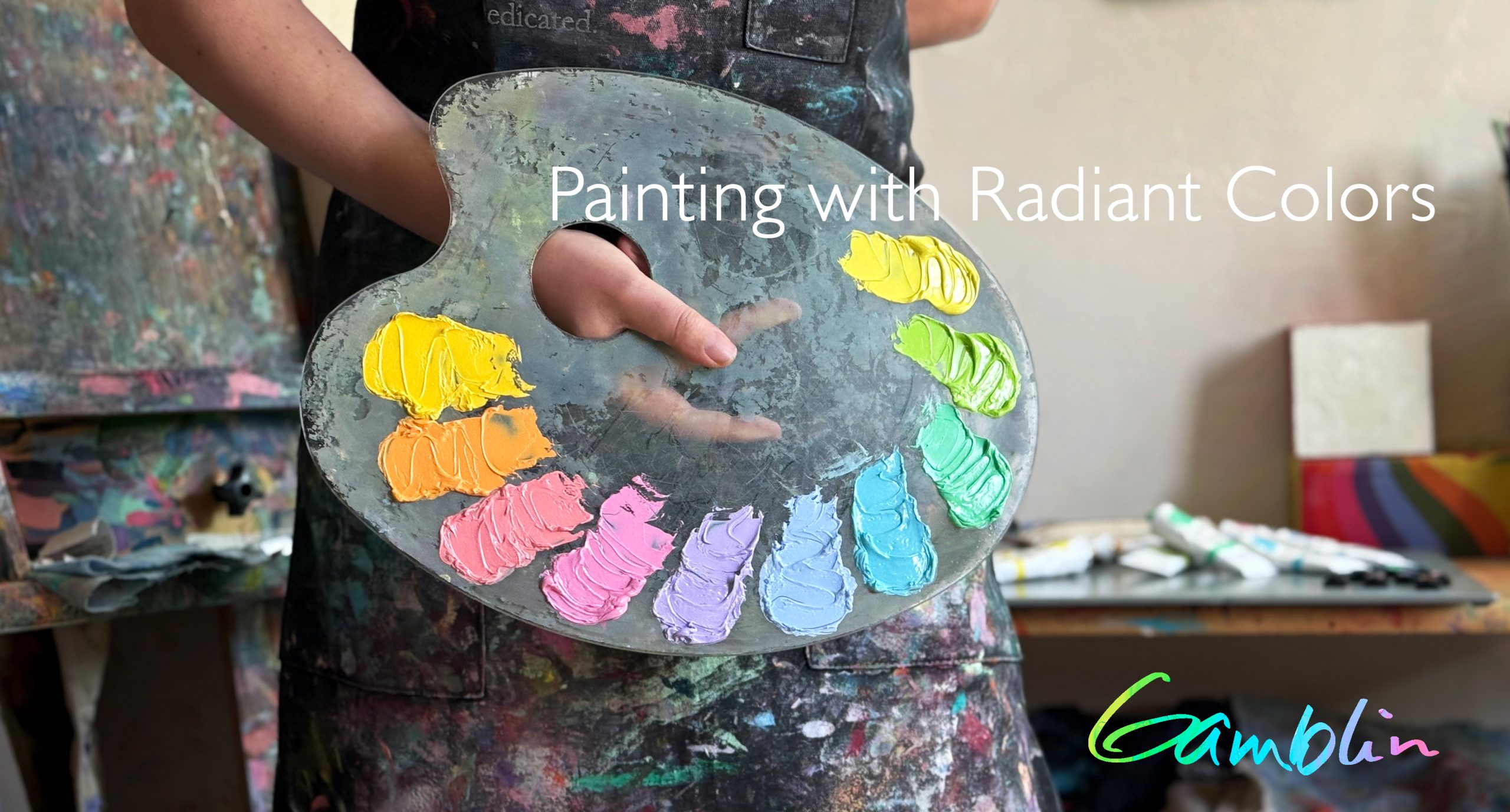
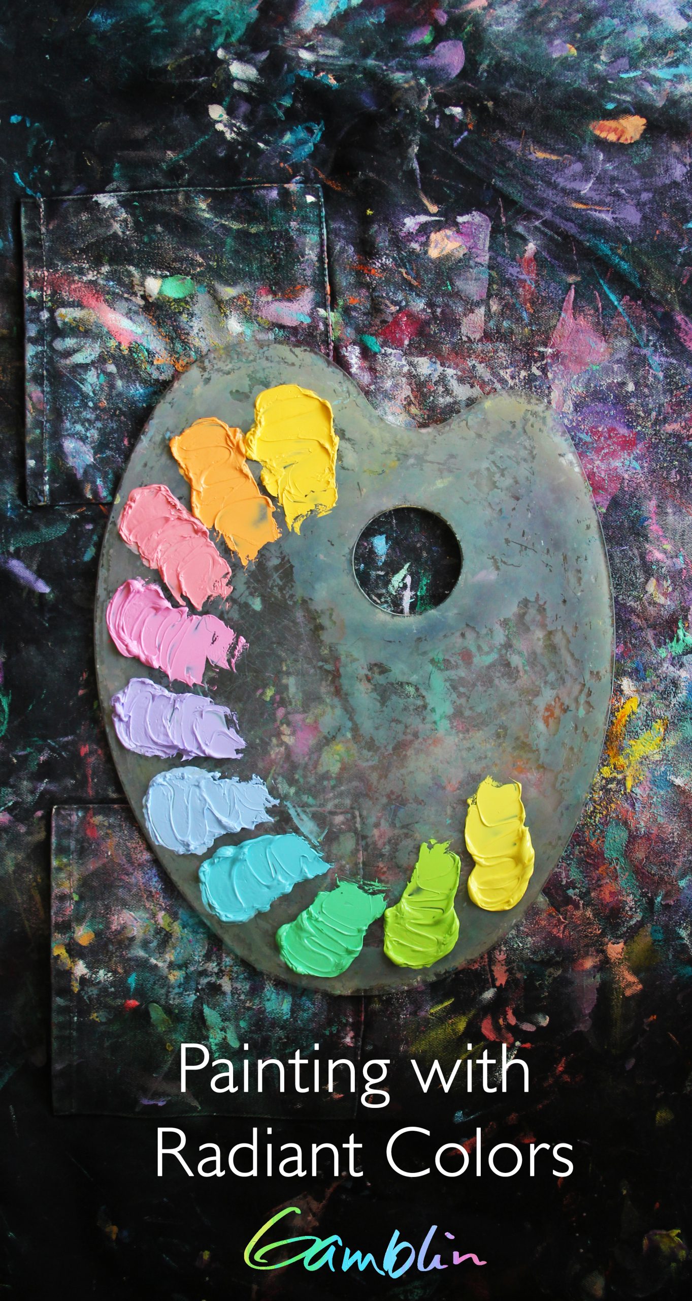
Gamblin Radiants work together as a system of accent colors, enabling artists to easily and predictably punch-up the color and intensity in their paintings. When used in mixtures, the Radiants allow painters to warm-up or cool-down colors without darkening them. Radiants can also neutralize colors into more nuanced mixtures.
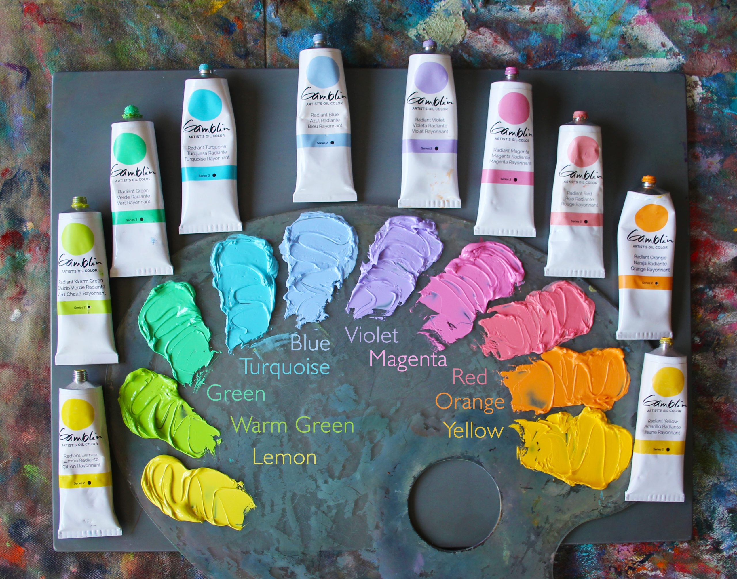
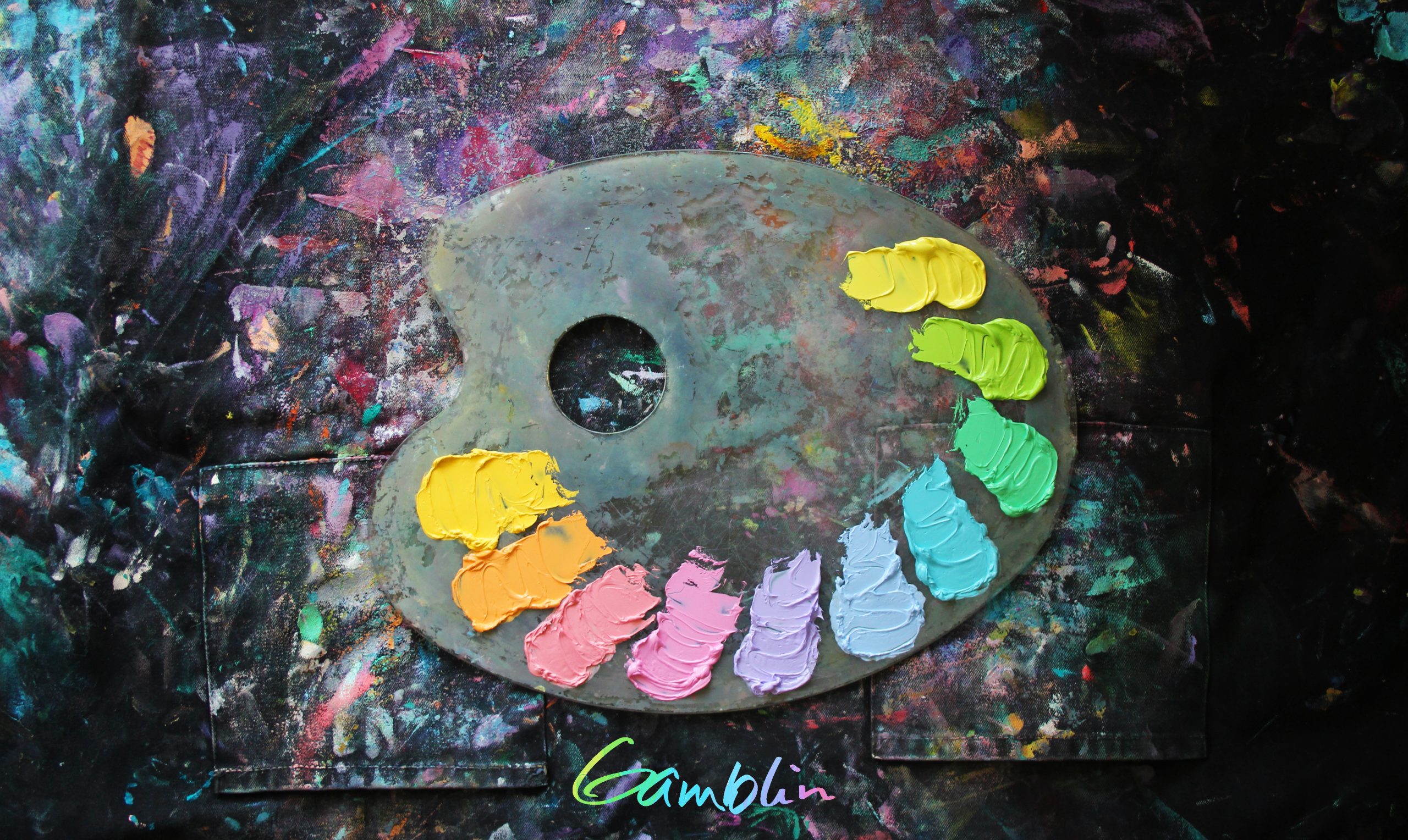
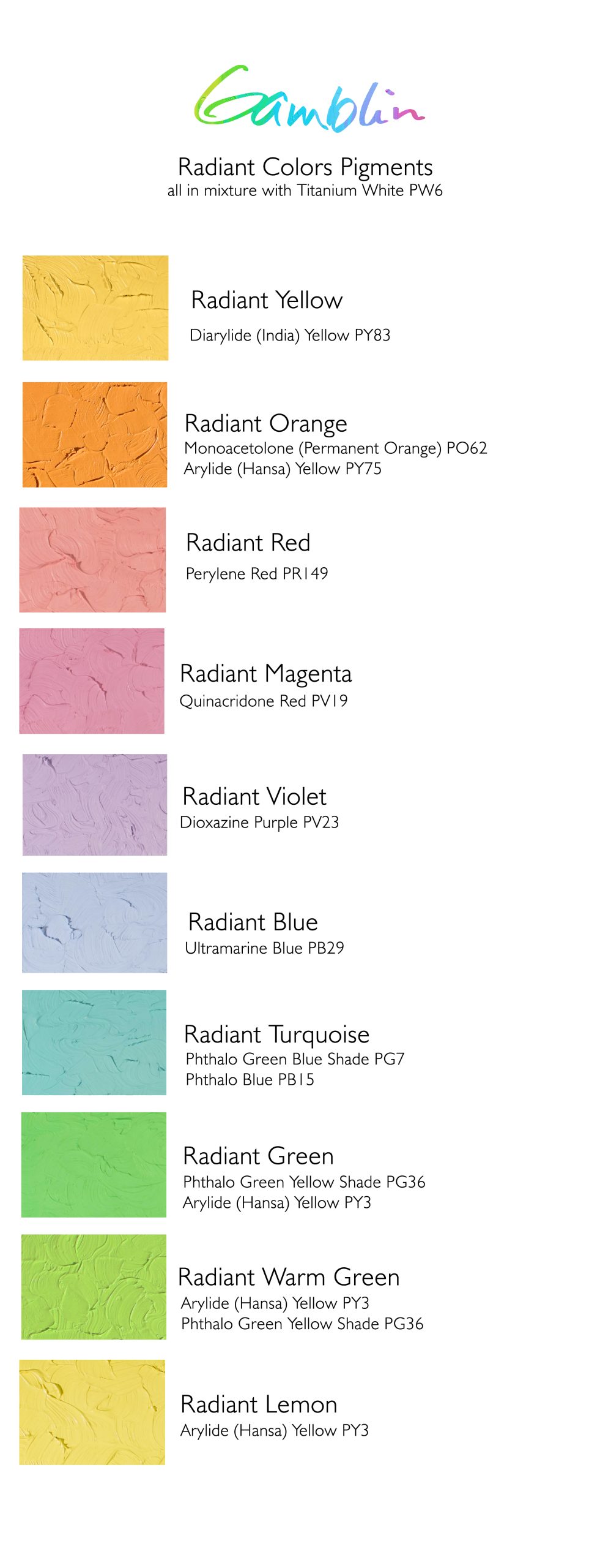
Gamblin Radiant Colors are composed of ten intense tints – mixtures of pure color and white, at or close to a Value 7 on the Munsell System.
Whether or not you are painting from life, the Radiant colors are wonderful shortcuts for all of your “high key” needs. In this page, we share how the Radiant Colors came to be and we showcase how painters utilize Radiant Colors in their work.

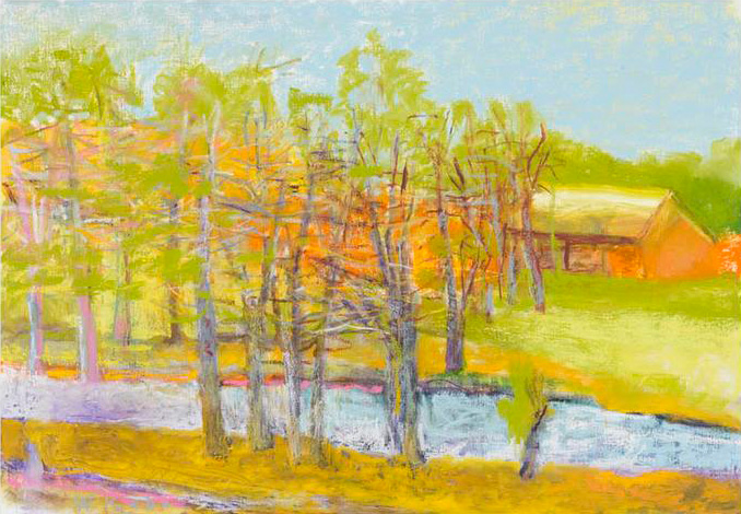
Wolf Kahn, A Brook Flows By It
Development: a Radiant collaboration
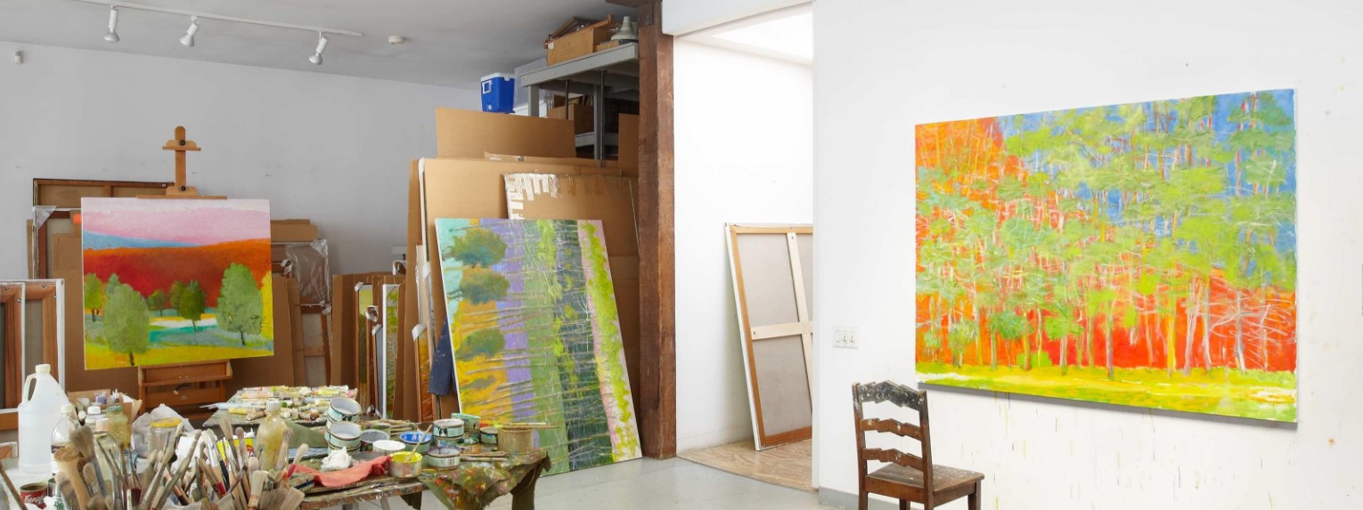
Gamblin Radiant Colors were developed out of Robert Gamblin’s friendship with painter Wolf Kahn (1927-2020) Wolf’s landscapes are spoken in the language of pure color – the natural world is expressed through a vibrant palette and bold shapes. Wolf was just as fluent in working with soft pastels as he was in oil paint. As pastels are a “dry” medium, one would have sticks of pure pigment (Ultramarine Blue, for example) plus several tints of that pigment at different values. Wolf took the same approach to his oil color palette – incorporating pure colors from the tube alongside lighter tints. Robert worked with Wolf in developing the eight intense tints that became known as Radiants. In 2026, we expanded the range from eight to ten tints with the addition of Radiant Orange and Radiant Warm Green, to round out the wheel in color selection and temperature.
Wolf Kahn’s Studio
Modern Tints
Each of the Radiant Colors are tints of modern organic pigments. The one exception is Radiant Blue, which is a tint of Ultramarine Blue.
Modern organic pigments retain their intensity in tints in mixtures, which is the reason the Radiant Colors maintain such a high chroma at their light values. It’s also worth noting that these modern organic pigments are transparent in nature, yet the Radiant Colors are all opaque, due to the addition of titanium white in their formulas.
Below is a listing of the Munsell values for the Radiant line, which do vary slightly with yellow, lemon, and the newest additions: Radiant Orange + Radiant Warm Green.
Radiant Blue = Value 7
Radiant Turquoise = Value 7
Radiant Green = Value 7
Radiant Warm Green = Value 8
Radiant Lemon = Value 9
Radiant Yellow = Value 8.5
Radiant Orange = Value 8
Radiant Red = Value 7
Radiant Magenta = Value 7
Radiant Violet = Value 7
Munsell value, hue, chroma and color temperature for all Gamblin colors can be found on our Color Temperature and Value List
Lena Danya, Weightless
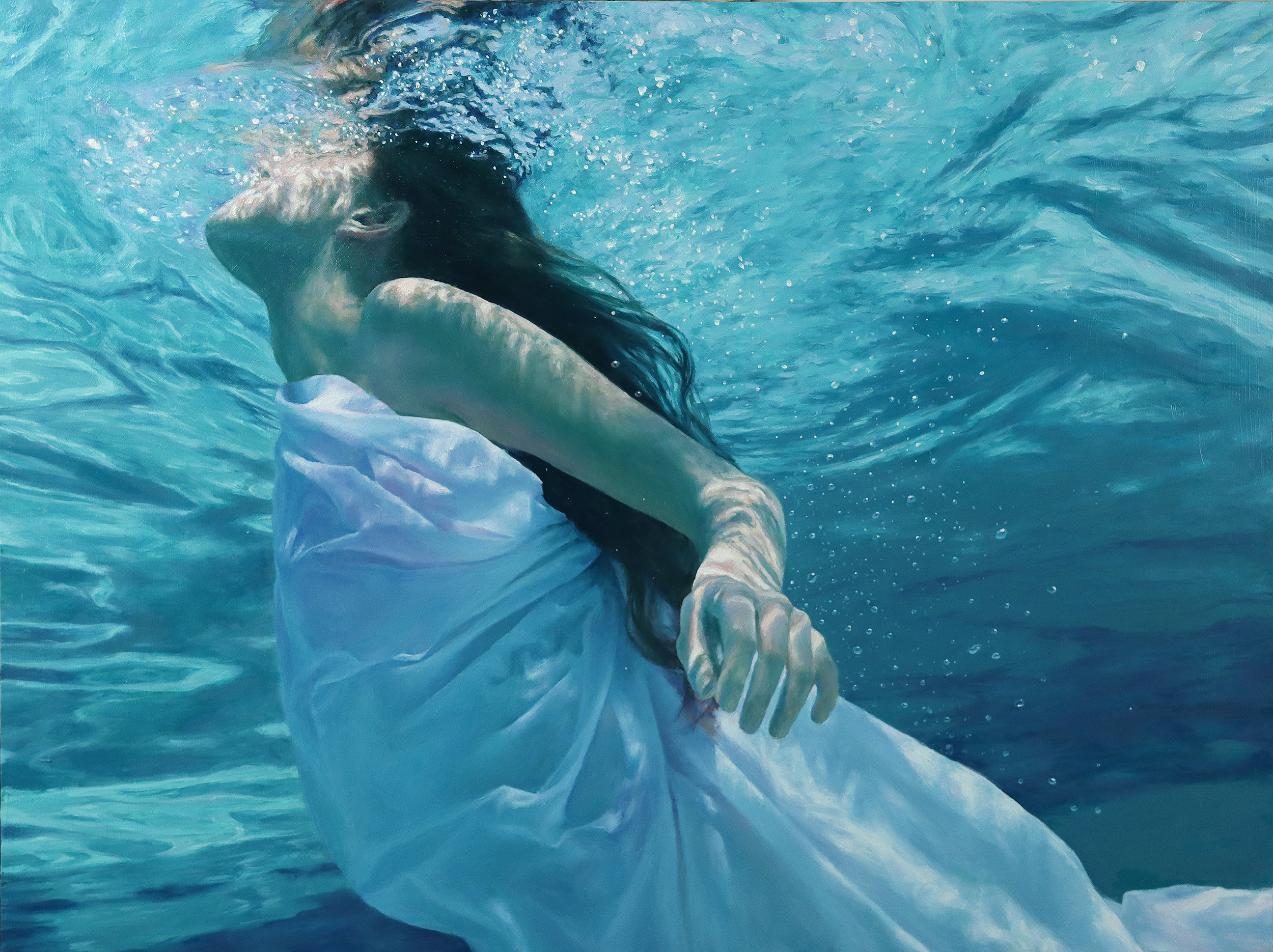
This painting might as well be a love letter to the Radiant colors. For the more varied degrees of blue and turquoise used in the water, I mixed Radiant Turquoise with Cobalt Teal for a lighter color. Small amounts of Radiant Green were added in the edges of the water ripples where the color temperature of the water leans more towards a warmer teal.
For the fabric folds, I utilized a combination of Radiant Violet and Radiant Blue, which created an effective gray-purple tone for warmer shadows. Additionally, I found that mixing Radiant Magenta with a hint of Cadmium Red Light produced the ideal soft tones for the skin of the figure while also being a complementary color to the teals and greens.

Lori Putnam, Blurred Lines
Here I use mixtures of Quinacridone Violet and Radiant Turquoise in this painting of snow on a sunny day.
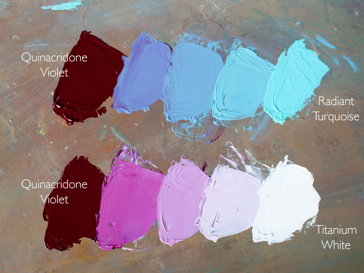
By lightening Quinacridone Violet with Radiant Turquoise instead of Titanium White, I will get more nuanced color mixing. The mixture of Quinacridone Violet and Radiant Turquoise passes through the blue section of the color wheel, yielding beautifully subtle mid-value blues. When Quinacridone Violet is mixed with straight white, the corresponding tints remain in violet hue family.
Mixing with Radiant Turquoise vs. Titanium White:
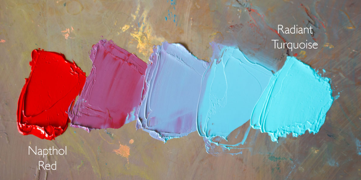
Radiant Turquoise, Radiant Violet, and Radiant Blue have become my first “go-to” colors for lightening values when cooler colors are needed. Rather than heading straight for my Titanium White, these colors serve me better because all three are cool, very light, and intense and they help with neutralizing colors. For example, if I am trying to neutralize Napthol Red and do not want a dark, warmer color (as I would get if mixed with its complement, Green), I add Radiant Turquoise. The result is a rich, cooler, mid-value color.
Napthol Red mixed with Radiant Turquoise:
Similarly, I can get a more natural violet by mixing Radiant Blue with my Napthol.
Napthol Red mixed with Radiant Blue:

Warm and Cool Radiant mixtures
Try this: mix Cadmium Orange with Radiant Turquoise in one pile and with Radiant Violet in another. These two greys will be the same value, but one will appear cooler and the other warmer. When placed next to one another in the distant landscape, the beauty of a late afternoon mountain comes to life.
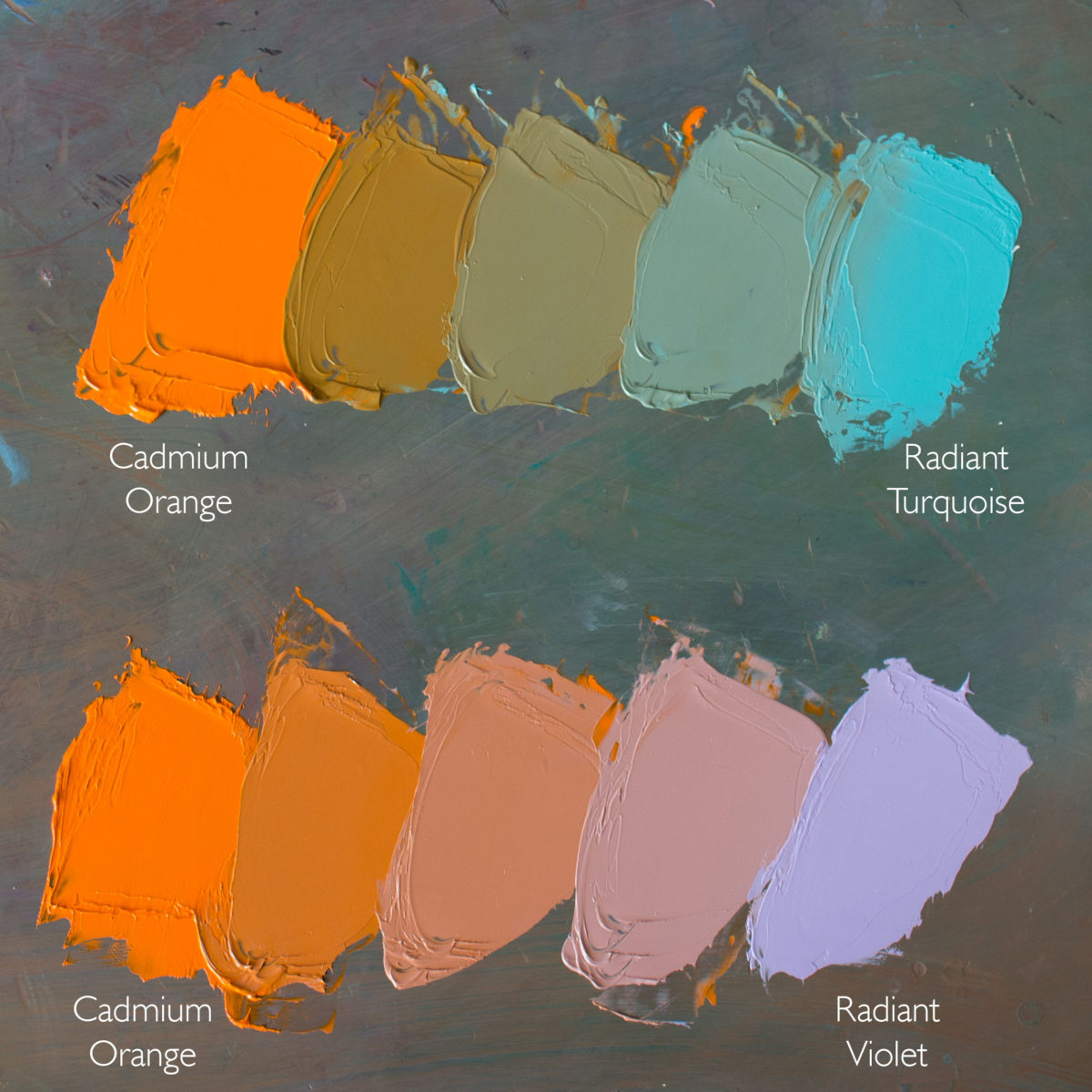
To see more of her work and learn more color mixing secrets from Lori, visit her website and Substack
Anna Rose Bain
More than Radiant
When I started experimenting with Gamblin’s line of Radiant colors, I expected they would end up in the “occasional use” drawer. To my surprise, I found myself employing them in nearly every painting—especially figurative works—with Radiant Green and Radiant Turquoise claiming permanent spots on my palette. Some of the others (like Radiant Red and Violet) join the party almost as often. Whenever I teach or give a portrait demo, the first thing people ask me about are “those bright colors” on my palette and how to use them.
I find Radiant Green and Radiant Turquoise particularly useful in adjusting the hue and/or temperature within a painting, while maintaining light values. Others in the Radiant line, such as Radiant Violet and Radiant Red, are almost impossible to substitute. The Radiant Violet is very cold in color temperature. I’ve seen nothing else like it on the market. Depending on the nature of the light source, Radiant Violet and/or Radiant Red are often the perfect choice for painting the brightest highlights on a model without having to default to titanium white.
In this passage of a recent alla prima portrait (below), you can see a subtle light blue along the temple area and around the eye socket. In those areas where there is a plane change, gradually turning away from the light, the color becomes cooler, but not necessarily darker. This was a perfect opportunity to use Radiant Turquoise.
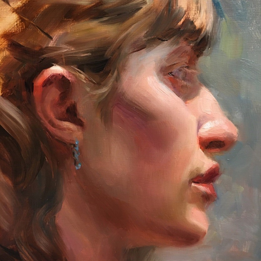
Anna Rose Bain, Kat Profile
In addition to creating luscious skin tones, the Radiant line is great for nailing local color. The little boy in this portrait (below) was wearing a white and sea-green shirt, and sat outdoors on an overcast day (so cool light). Instead of mixing white with Phthalo or some other darker color, I was able to use Radiant Green almost straight out of the tube for that shirt. Additionally, you can see passages in his face and throughout the painting (leaves, stone steps, etc.) where I mixed the green and turquoise in, creating an overall harmony for the piece.

Anna Rose Bain, Simon
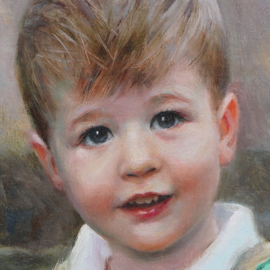
Anna Rose Bain, Simon (detail)
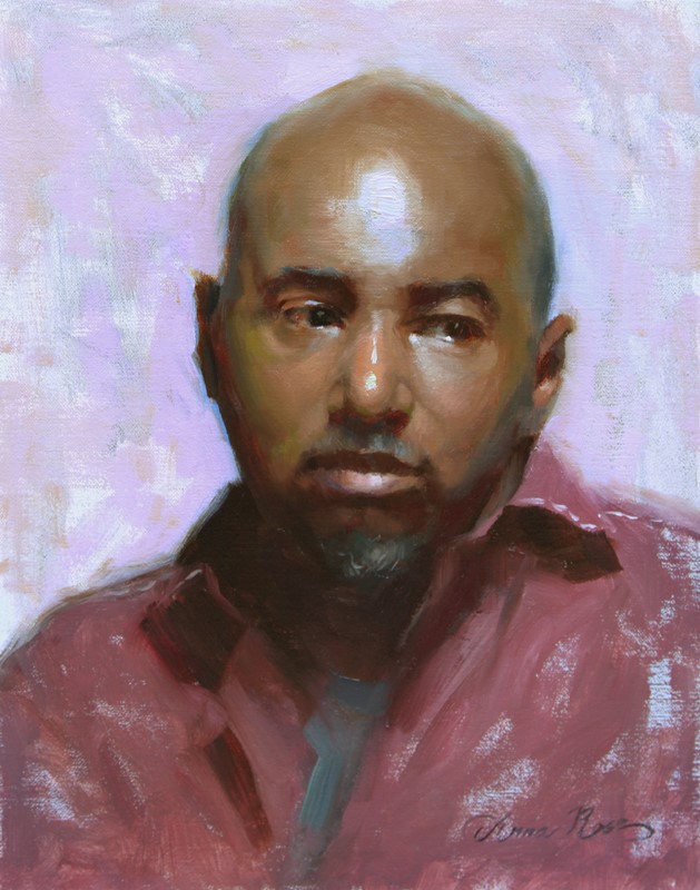
In this portrait of Colquitt (below), I used Radiant Violet all over the background (in front of a light transparent wash of ivory black), and for the bold highlight in the middle of his forehead.


Lori Putnam, Blurred Lines
Here I use mixtures of Quinacridone Violet and Radiant Turquoise in this painting of snow on a sunny day.
By lightening Quinacridone Violet with Radiant Turquoise instead of Titanium White, I will get more nuanced color mixing. The mixture of Quinacridone Violet and Radiant Turquoise passes through the blue section of the color wheel, yielding beautifully subtle mid-value blues. When Quinacridone Violet is mixed with straight white, the corresponding tints remain in violet hue family.
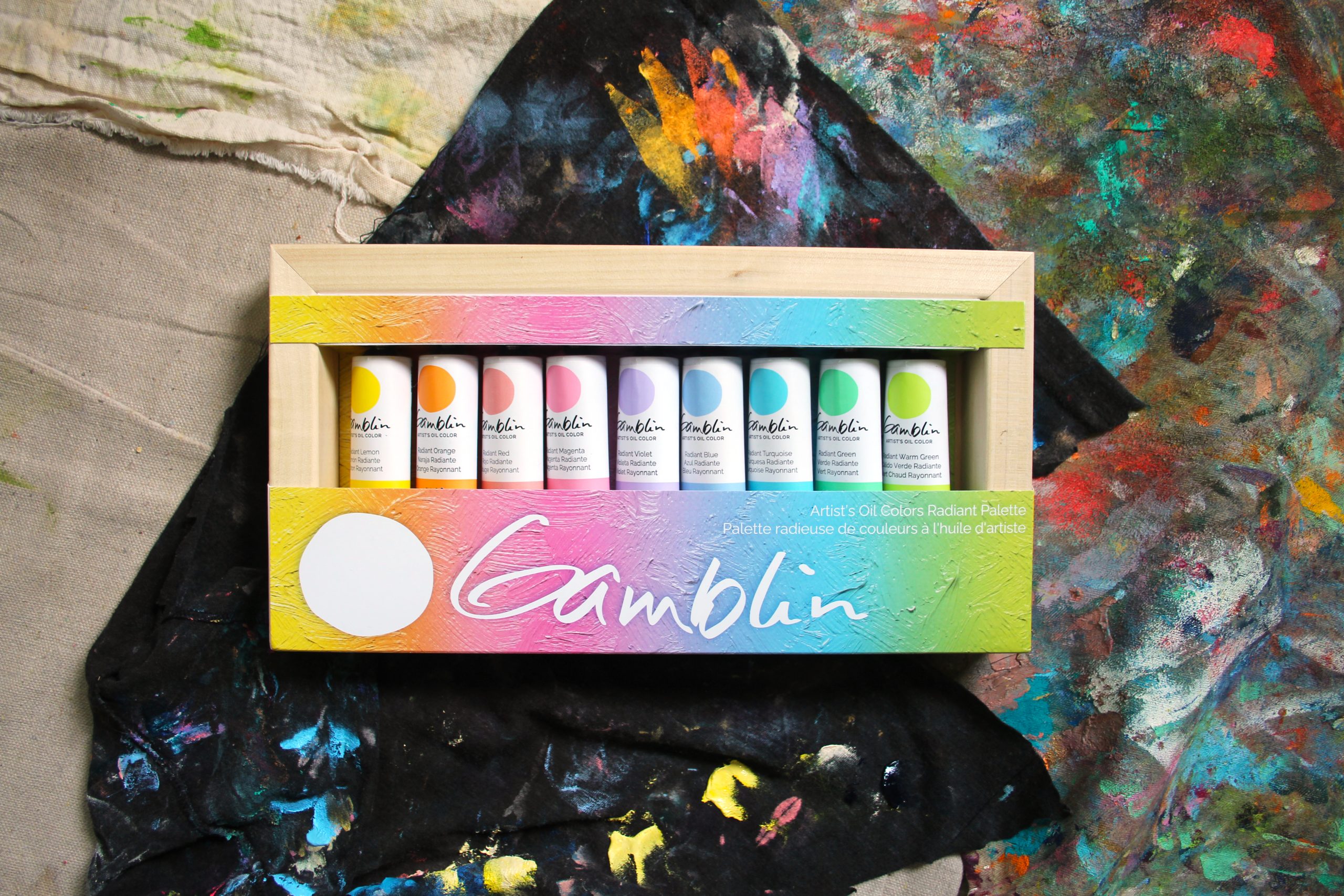
A must have color mixing tool.
Elevate your palette with a set of our Radiant colors. This collection offers a full chromatic range, enabling you to fine tune all the colors on your palette, plus a primed, handcrafted panel made from sustainably forested North American birch.
Our Radiant Colors set includes 9 x 37 ml (1.25 oz) tubes of each color, with the exception of Radaint Yellow.
Take me back to the Experience Color menu