
Why 24 new colors? What’s next?
We are colormakers. This is what we do. Everything truly great we’ve created has come from listening. These colors are a product of that. Behind each one is years of insight from artists we work closely with, our own studio practices, your feedback, and a relentless dedication to getting it right.
On average, we can discern about five million shades of color. As painters and a colorhouse, we have less than 100 pigments that meet our standards for oil painting. And what pigments we have to work with not only vary widely in working properties but they are also scattered unevenly through color space like constellations, bunches here and there and often wide gaps with no pigment to fill them.
We began this chapter in color development several years ago, and we are nowhere near finished. We have more colors on the way that solve real problems for painters and create meaningful, new possibilities. We’re painters too. As we continue our work, count on us to put our heads, hearts, hands, and everything we’ve learned into everything we do. If there’s a better way, we will find it. We always do.
We look forward to hearing from you. Always forward. Together.
What are the new Artist Grade colors?


Now take a closer look. Click the swatches below to enlarge.
More inspiration can be found by clicking the color name.
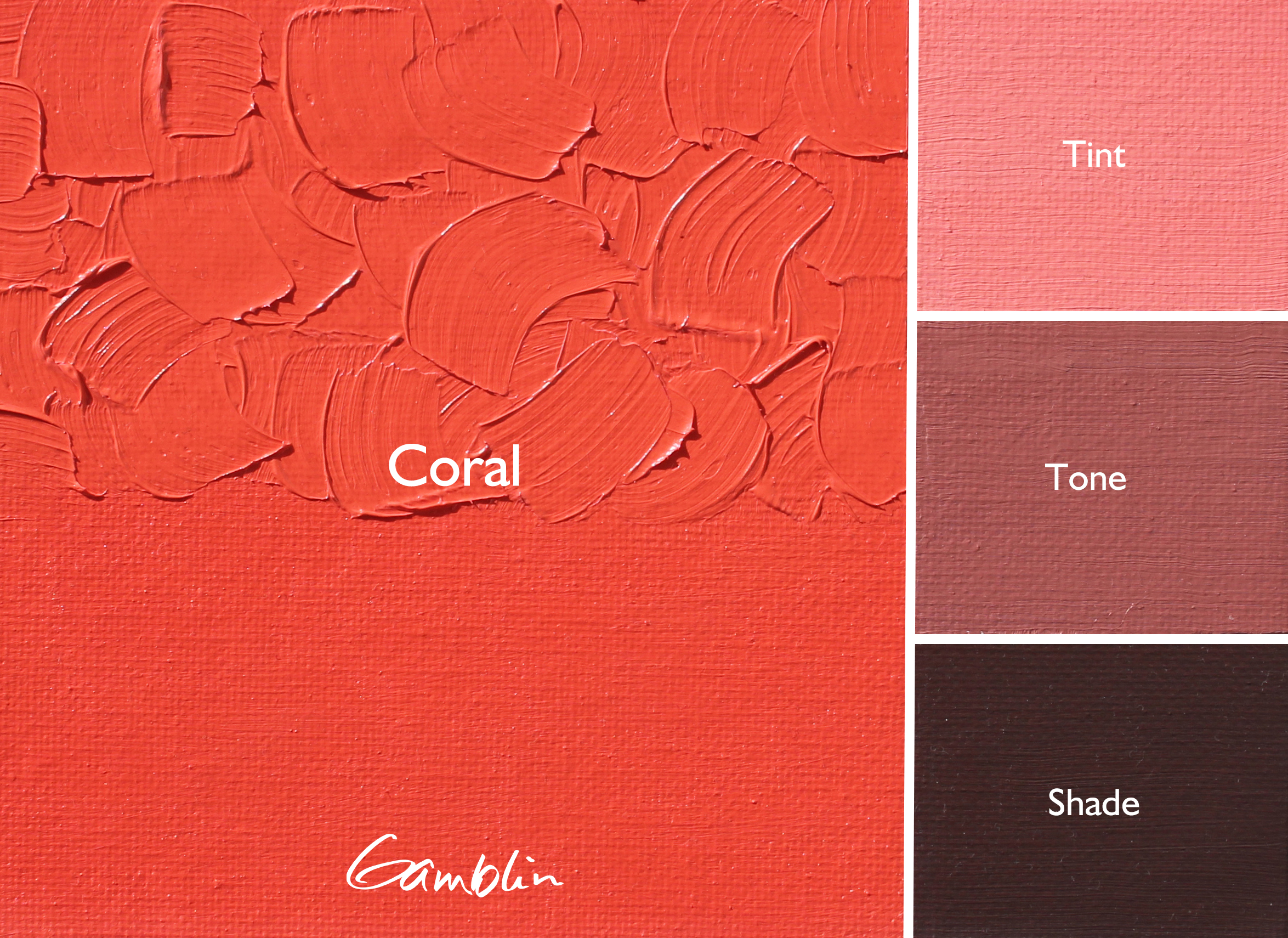
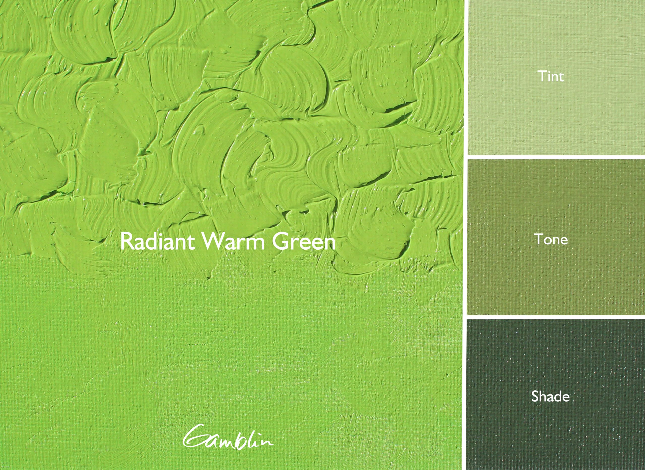
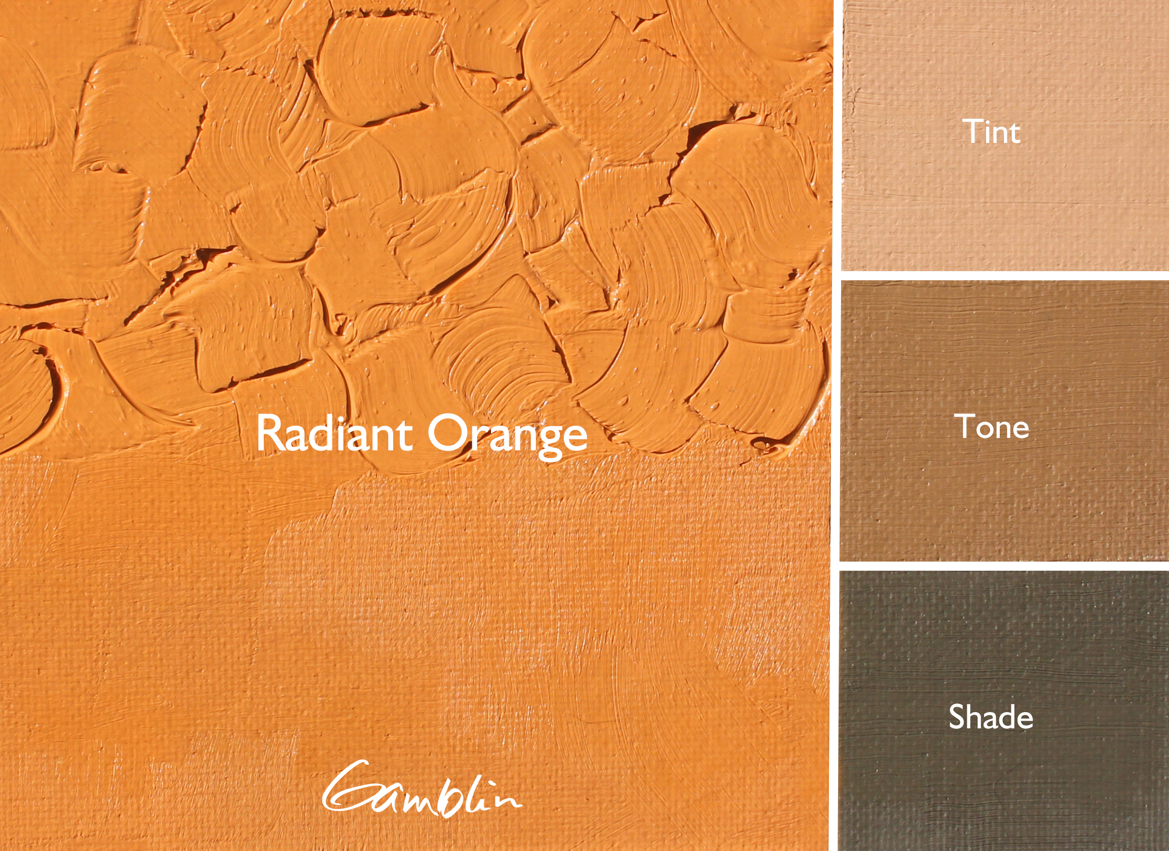
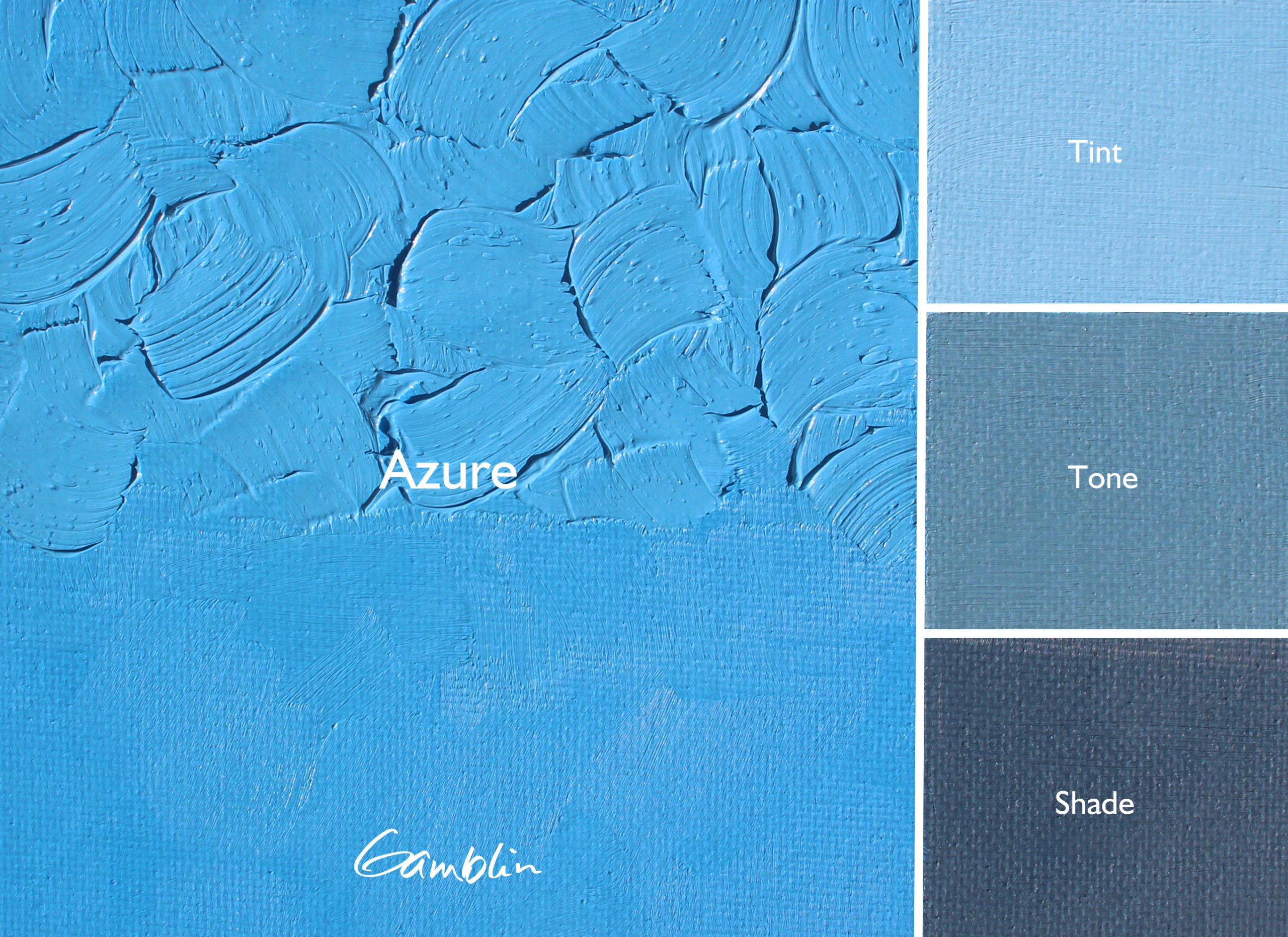
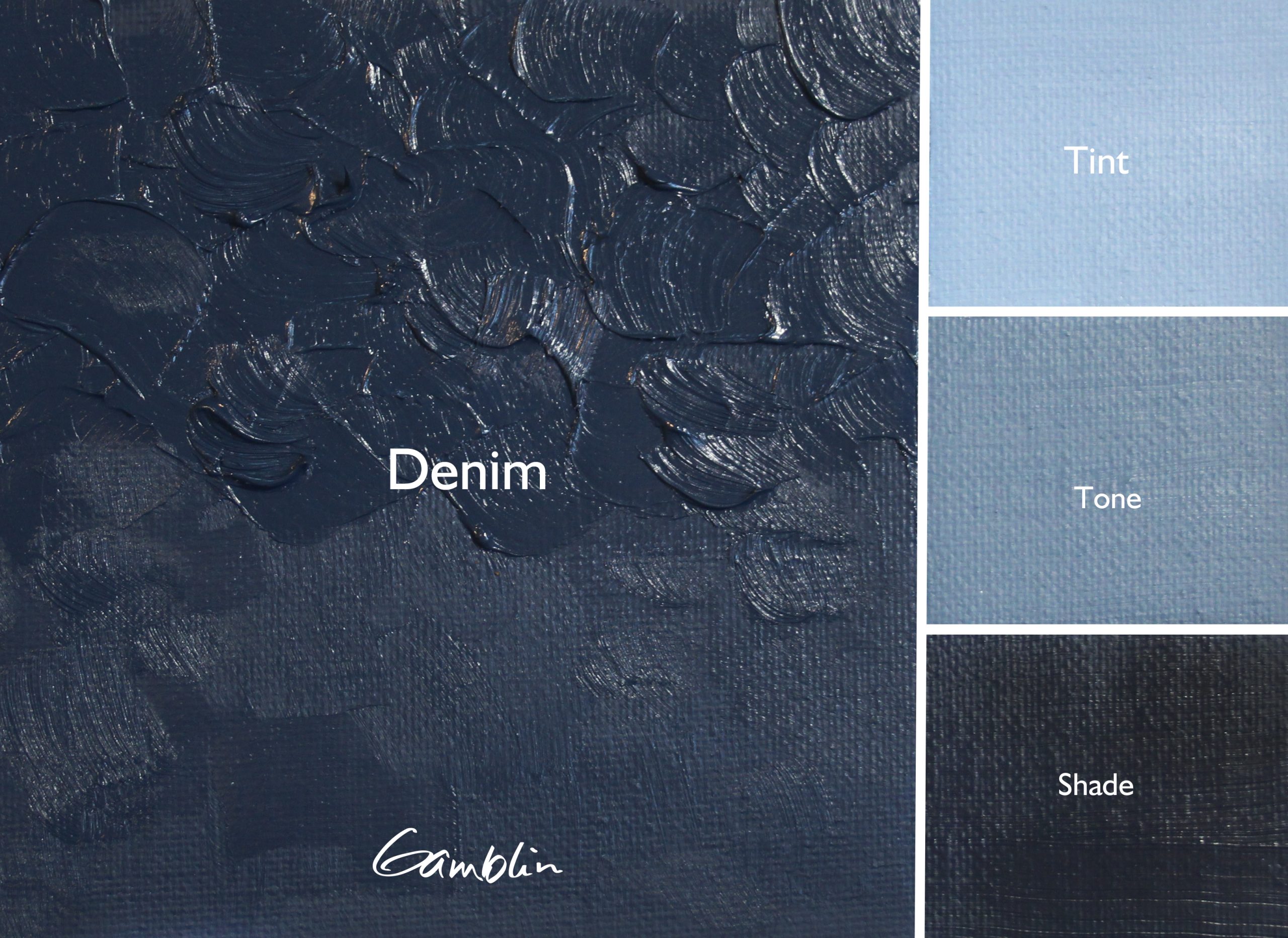
Tint = Color + Titanium Zinc White
Tone = Color + Portland Grey Medium
Shade = Color + Chromatic Black
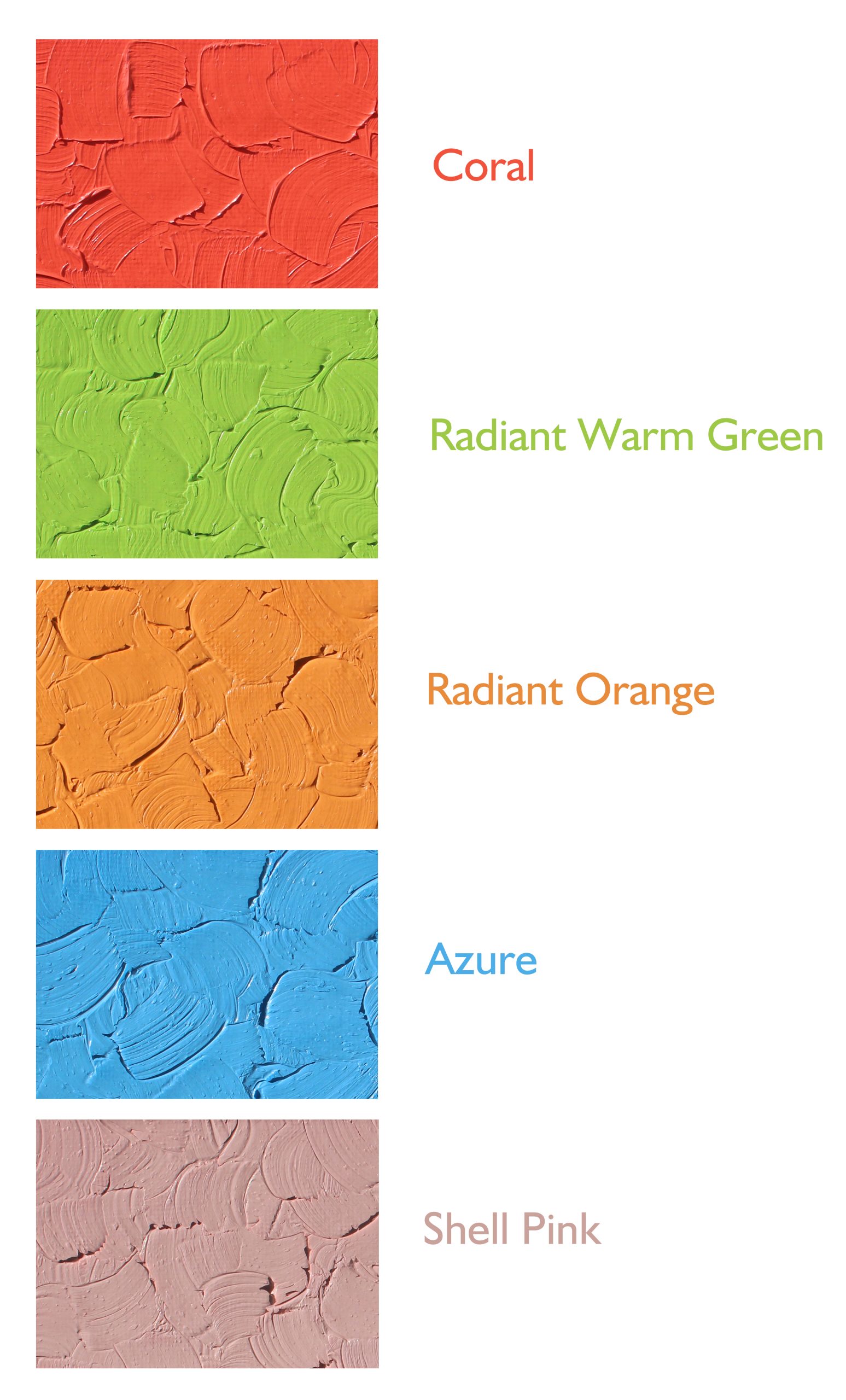
Coral
Our Artist Grade Coral skirts the boundary between red and orange hue families. We felt that there are so many interpretations of what Coral can be, from red to orange shades and from deep to pale values. Our interpretation of Coral in Artist Grade is deeper and bolder, with full-tilt coral intensity.
Pigment: PO62, PR188, PW6
Vehicle: Alkali refined linseed oil
Lightfastness II, Series 2, Opaque
Color Temperature: Warm
Radiant Warm Green
Our range of Radiant colors includes warm and cool tints in the red, yellow, and blue hue families. With the addition of Radiant Warm Green, painters now have a warm and cool green to choose from.
Pigment: PY3, PG36, PW6
Vehicle: Alkali refined linseed oil
Lightfastness II, Series 2, Opaque
Color Temperature: Warm
Radiant Orange
Radiant Orange is a warm, central orange that fits between our Radiant Yellow and Radiant Red. Our Radiants work together as a system of accent colors that also enable artists to easily and predictably punch-up the color and intensity in their paintings.
Pigment: PO62, PY75, PW6
Vehicle: Alkali refined linseed oil
Lightfastness I, Series 2, Opaque
Color Temperature: Warm
Azure
We took the same approach to designing Azure that we used to develop our Radiants. We began with a modern organic pigment as the foundation and then pushed it toward its limit in tint. Our intention was to craft a sky blue that was warmer and paler than Sevres, and that could fit right between Radiant Blue and Radiant Turquoise in color space.
Pigment: PB15:2, PB29, PW6
Vehicle: Alkali refined linseed oil
Lightfastness I, Series 2, Opaque
Color Temperature: Warm
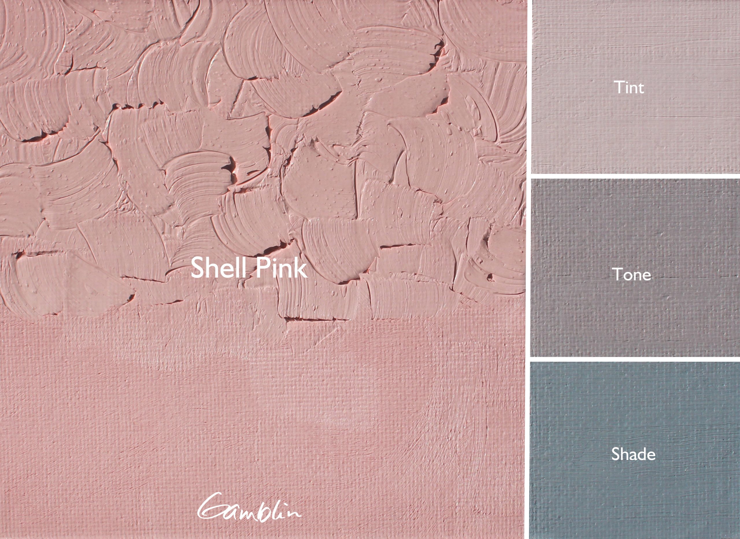
Shell Pink
Lighter than our Radiants in value, with softer chroma. Shell Pink can bring soft rosy warmth to faces and places. Like Coral, we had to nudge our warmest red further toward yellow color space. We pushed Napthol Scarlet and Hansa Yellow Light to the very edge of their tinting strength to get the perfect color and intensity.
Pigment: PR188, PY3, PW6
Vehicle: Alkali refined linseed oil
Lightfastness II, Series 2, Opaque
Color Temperature: Warm
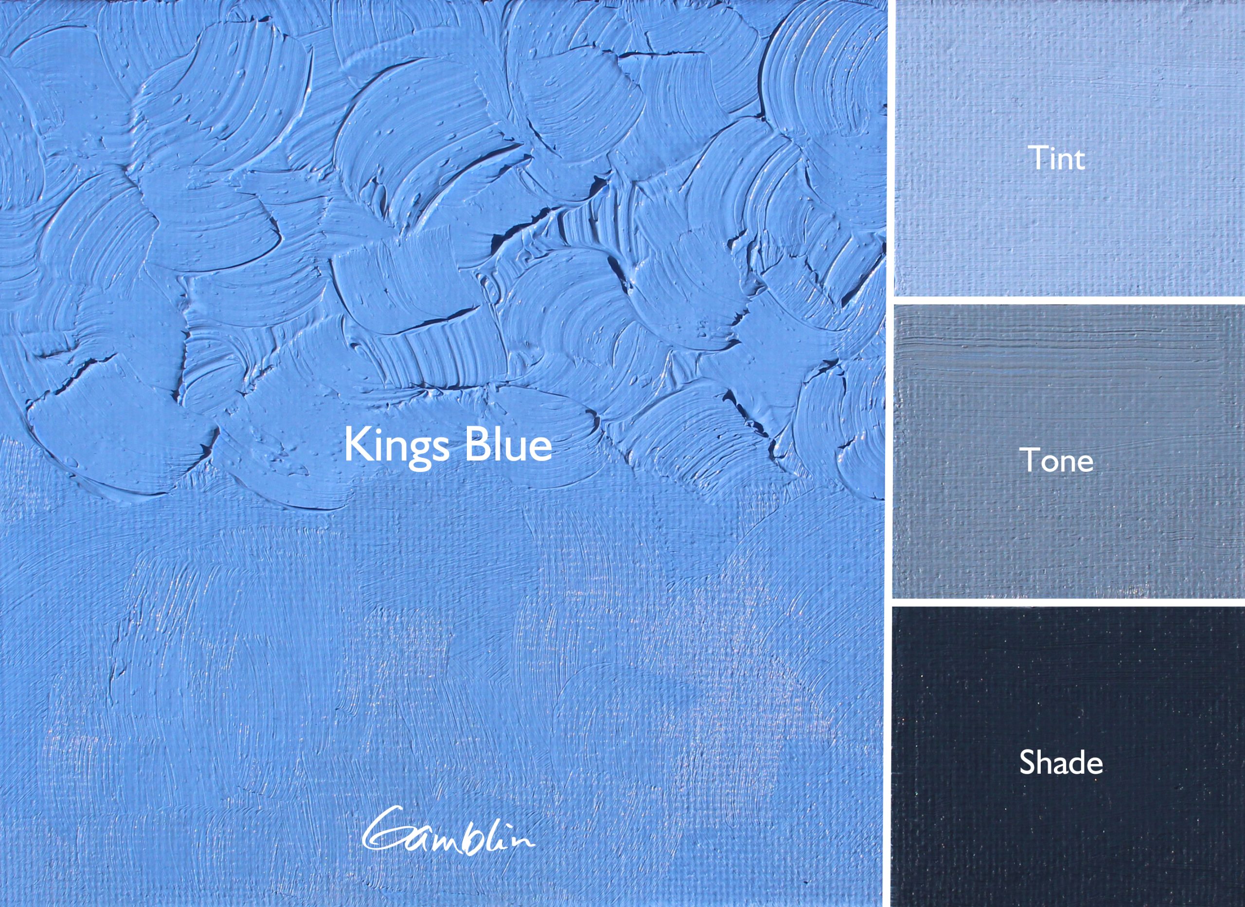
Kings Blue
A traditional Kings Blue, indispensable for painting sky and water. Warmer and more violet than our Radiant Blue and deeper in value. Our Artist Grade formulation is deeper in value than our 1980 interpretation of this color.
Pigment: PB29, PW6
Vehicle: Alkali refined linseed oil
Lightfastness I, Series 2, Opaque
Color Temperature: Warm
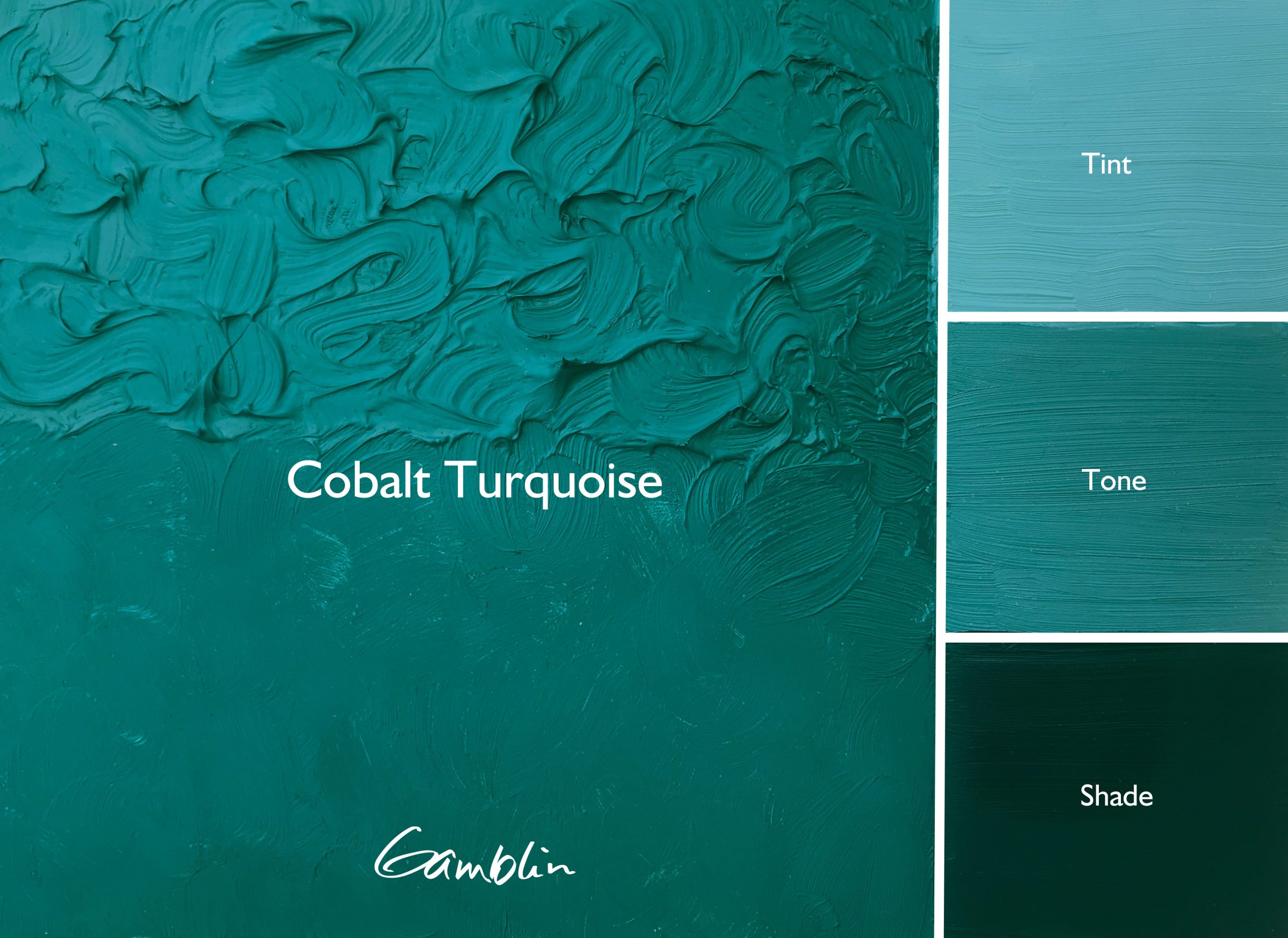
Cobalt Turquoise
Pigments have to be truly useful and create meaningful, new possibilities to earn a place on our palette. Cobalt Turquoise is one of them and stands out as the only single-pigment turquoise available to artists. Livelier than our Cobalt Green, this color lives in color space between Cobalt Teal and Cobalt Green. More opaque, more natural looking, and less intense than Phthalo Turquoise.
This color was first introduced in 2017 as a free sample at the Plein Air Convention and Expo. Many thanks to the countless artists who encouraged us to produce this color.
Pigment: PB36
Vehicle: Alkali refined linseed oil
Lightfastness I, Series 4, Opaque
Color Temperature: Cool
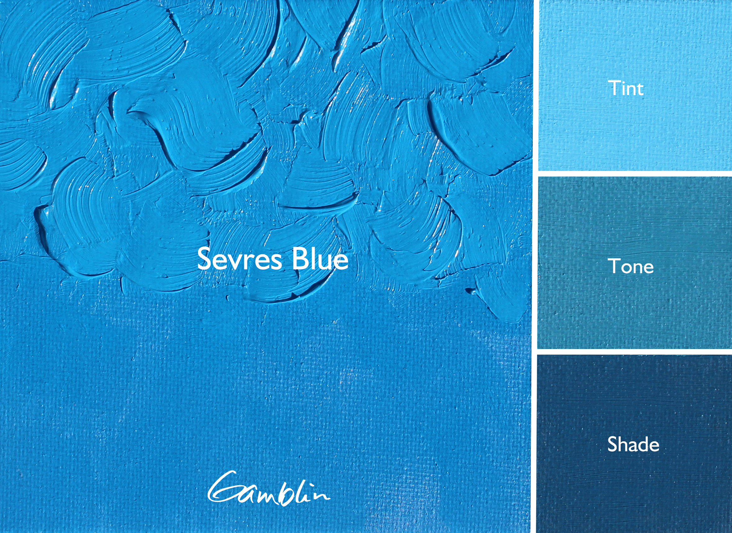
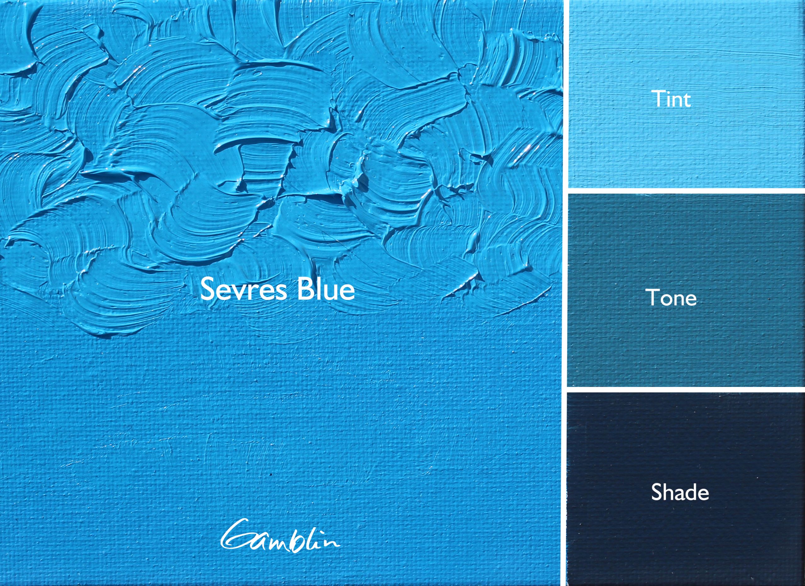
Sevres Blue
Inspired by the iconic glazes of 18th-century Sevres Porcelain, Sevres Blue is a modern interpretation of a classic. We combined red and green shade phthalo blue pigments in order to create a more balanced blue—you’ll find that it’s warmer than Cerulean Blue Hue while cooler than tints of our Phthalo Blue. Great for depicting open skies, Sevres can be particularly useful towards the top of a composition, where the sky radiates its deepest and richest blues, evoking the clarity and depth of the upper atmosphere.
Pigment: PB15:4, PB15:2, PW6
Vehicle: Alkali refined linseed oil
Lightfastness I, Series 2, Opaque
Color Temperature: Cool
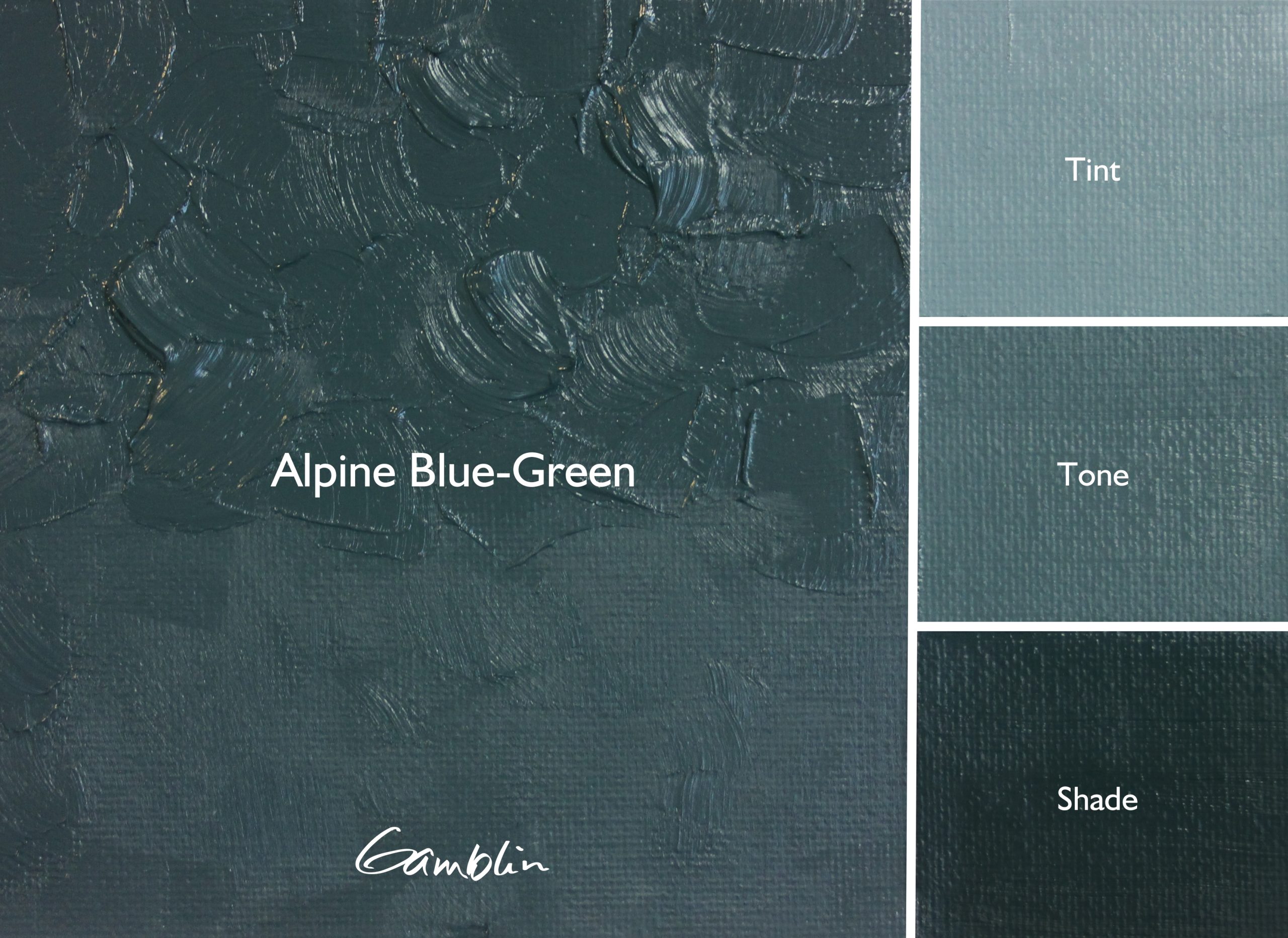
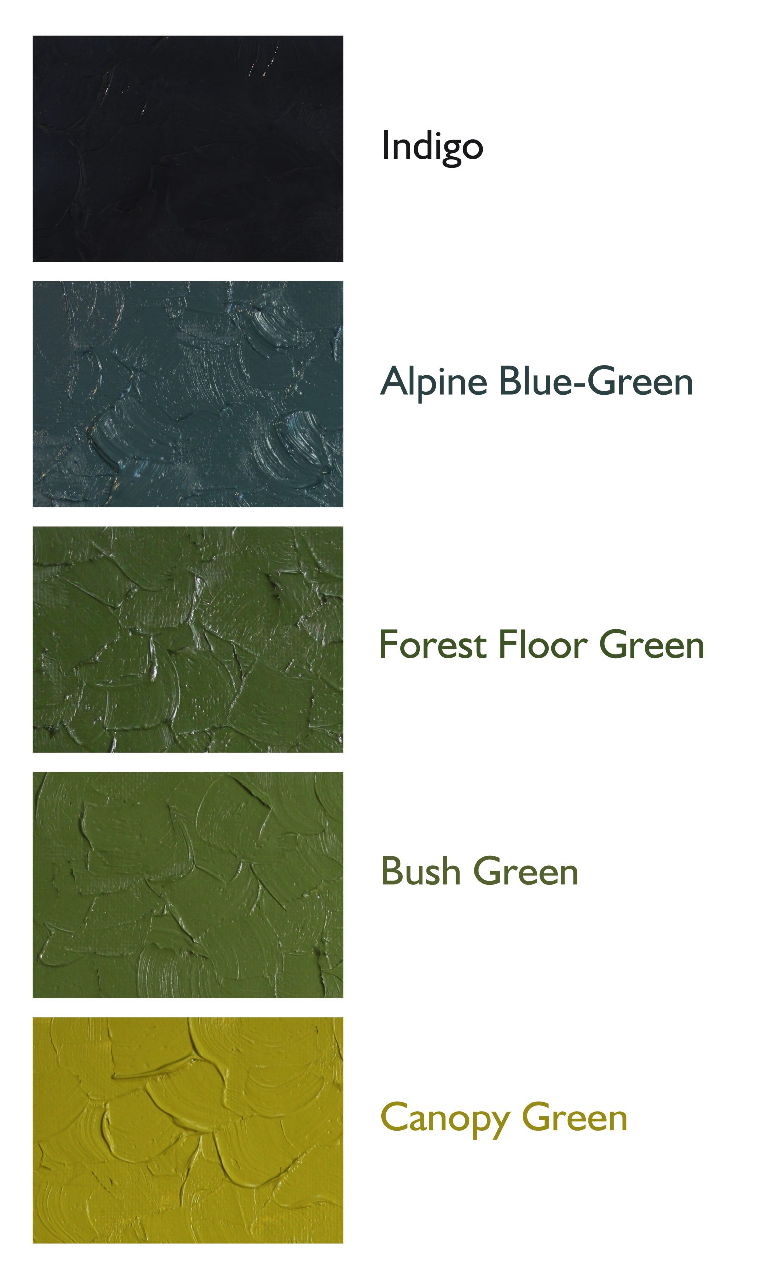
Alpine Blue-Green
The coldest and bluest of our Useful Greens. The blue-greens of alpine forests, valleys, and distant mountains. Useful in tints for distant foothills and mountains. Useful for evergreens and high elevation foliage, Alpine Blue-Green’s reduced temperature helps convey warm greens that appear cool through the blue of distance.
Pigment: PB28, PBr7, PW6
Vehicle: Alkali refined linseed oil
Lightfastness I, Series 2, Semi-transparent
Color Temperature: Cool
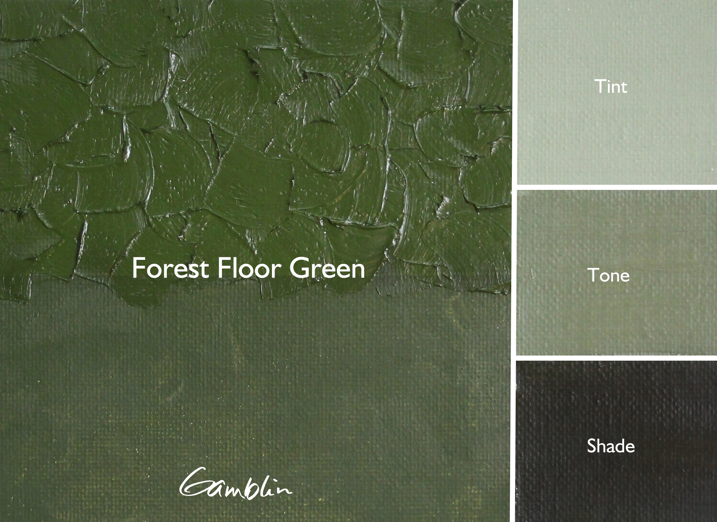
Forest Floor Green
The deep, warm moss green of the forest floor. Ideal for dark areas or shadows in trees and forests and other flora. This is your go-to for blanketing the undergrowth and tucking the shadows in. Forest Floor is composed of our warmest shade of cadmium yellow and our warmest blue. Cooler than Canopy Green and Bush Green, but still very much on the warm side of green.
Pigment: PY37, PB29
Vehicle: Alkali refined linseed oil
Lightfastness I, Series 2, Semi-transparent
Color Temperature: Warm
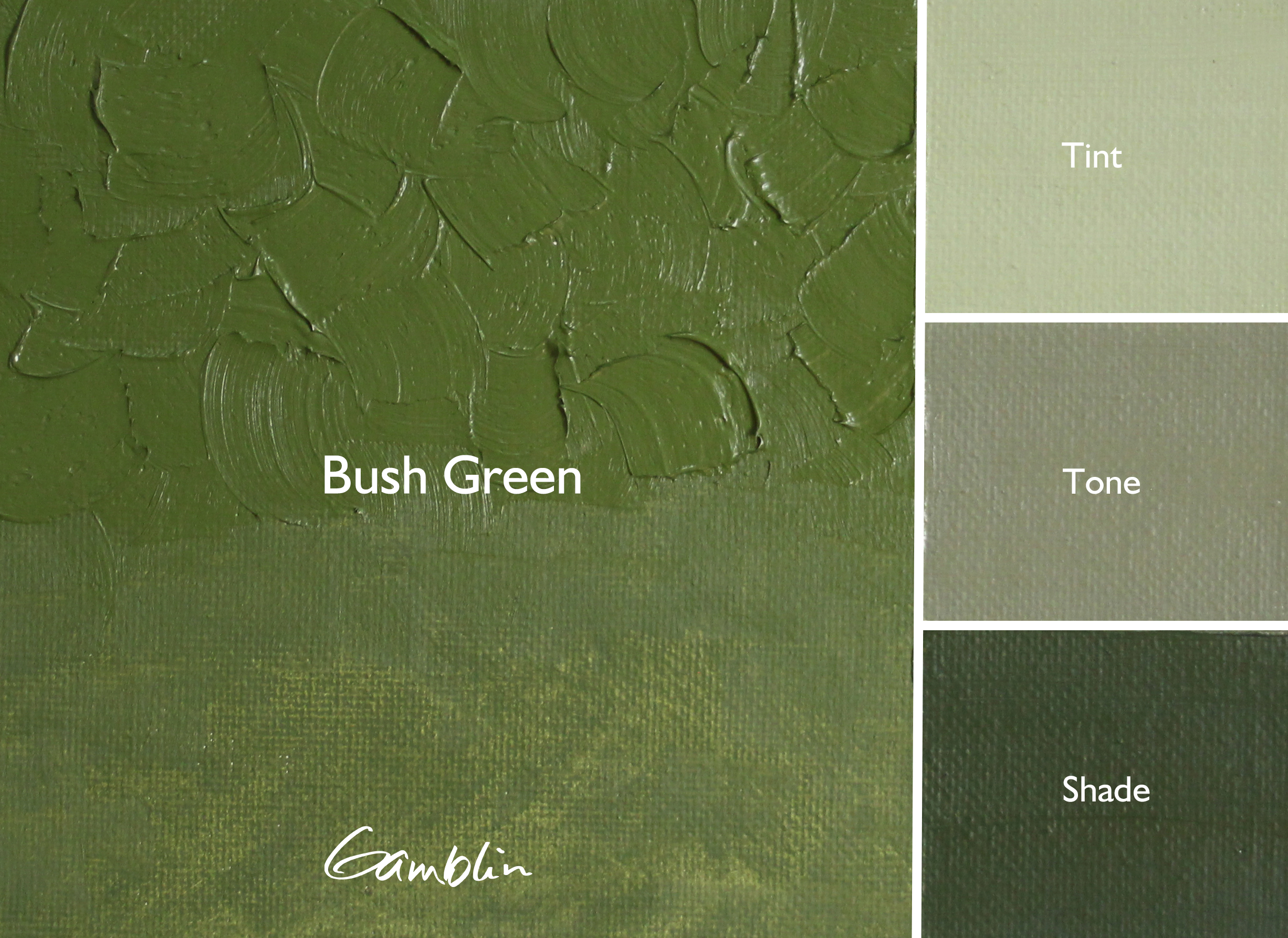
Bush Green
The middle green in our family of Useful Greens. This is your mid-value, bulk green. Ideal for capturing bushes, shrubs, forest understory, and foothills in the foreground. The colors found in a savannah or cactus. Chromium Oxide can get you close to this colorspace. But unlike Chromium Oxide Green, Bush Green retains greater warmth and chroma in tints.
Pigment: PY35, PY43, PB29
Vehicle: Alkali refined linseed oil
Lightfastness I, Series 2, Semi-transparent
Color Temperature: Warm
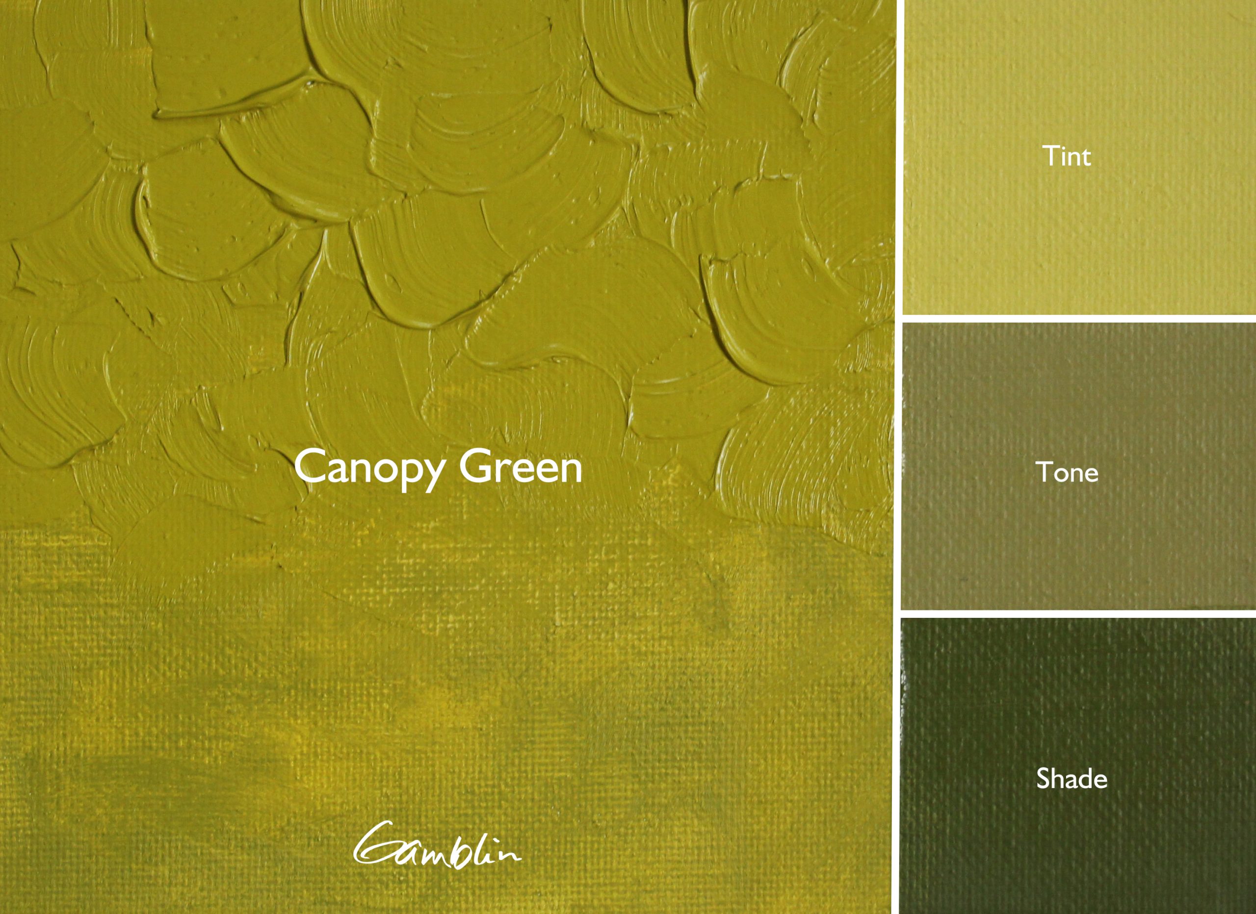
Canopy Green
The warmest and lightest of our Useful greens. Canopy Green is the color of the warmest areas of a tropical palm tree. In color space, it is located where green and yellow come together. Using the Munsell color system, we can identify the color space corridor where Canopy Green resides as the wedge between 10Y and 2.5GY.
Pigment: PY35, PY83, PB29
Vehicle: Alkali refined linseed oil
Lightfastness I, Series 2, Semi-transparent
Color Temperature: Warm
Indigo
A true, deep, indigo blue. Formulated to work perfectly as a rich blue to mix with our Useful Greens. Indigos formulated with modern pigments are overpowering in mixtures and too green…always landing at a minty green that’s easy to get other ways and too cool in temperature.
Our Indigo offers the depth of a chromatic black without overwhelming the palette, while providing easy access to smokey blue glazes when thinned. It also greys down easily in tints and is mutable in mixtures.
Pigment: PB15:2, PV15, PBr7
Vehicle: Alkali refined linseed oil
Lightfastness I, Series 3, Semi-transparent
Color Temperature: Cool


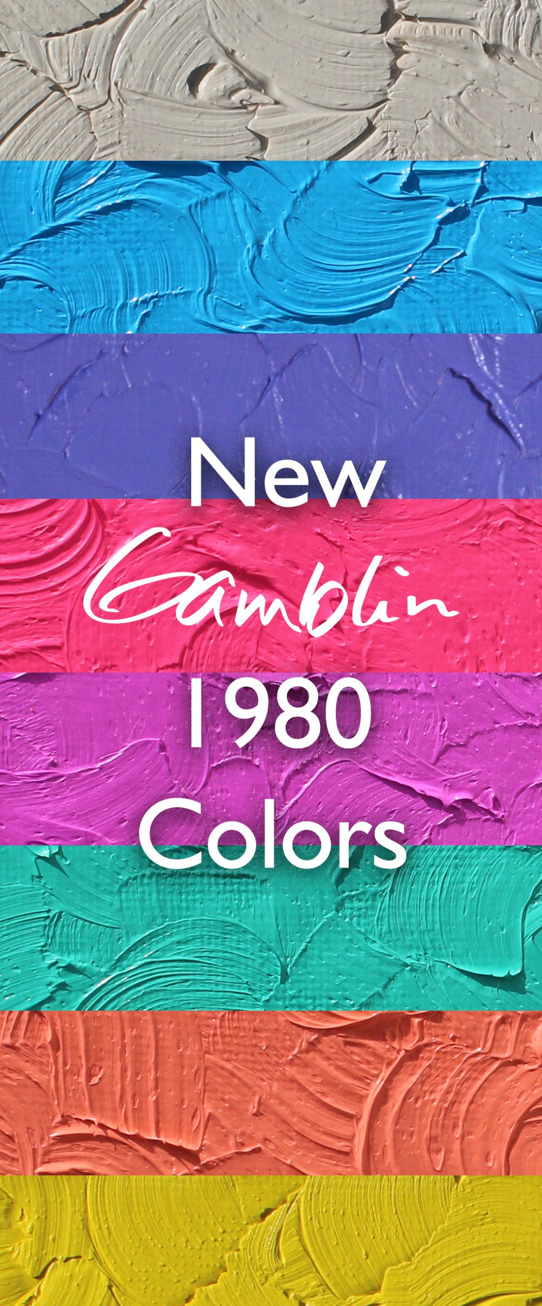
Tell me more about the new 1980 Colors
Buttery texture. Bold opacity. Vivid personality. Some of these colors you’ll recognize with their Artists Grade counterparts, namely: Kings Blue, Sevres Blue and Coral. For our 1980 range, rather than replicating the flagship series color with reduced pigment load, we chose to offer a different shade for these colors. By only reducing the concentration of one of their pigments rather than making a reduction across the board, their formulations impart a paler and gentler interpretation.
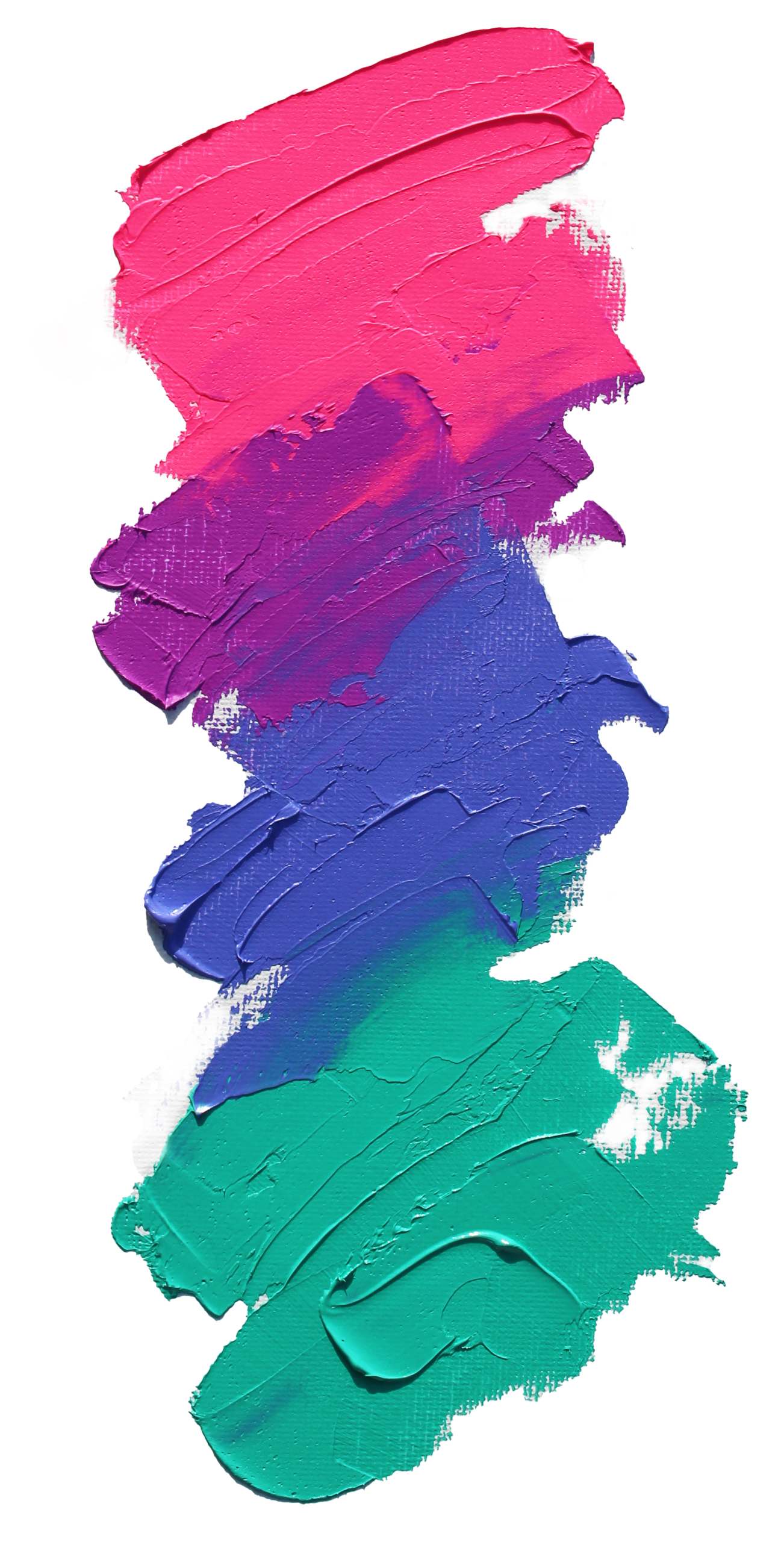
Other colors are both entirely new and unique to our 1980 range. Think of the 80s—a decade so loud we still hear its echoes in contemporary art, music, and popular culture. These colors aren’t meant to sit quietly behind museum glass. They’re made to electrify your artwork and gallery walls on opening night. Our fluorescents deliver maximum pigment load. With Hot Pink and Hot Violet you’re actually getting Artist Grade levels of pigment concentration. These hot colors don’t hold back and neither did we.
Meet the new Gamblin 1980 additions
Click the swatches below to enlarge.
More inspiration can be found by clicking the color name.
Tint = Color + Titanium Zinc White
Tone = Color + Portland Grey Medium
Shade = Color + Chromatic Black
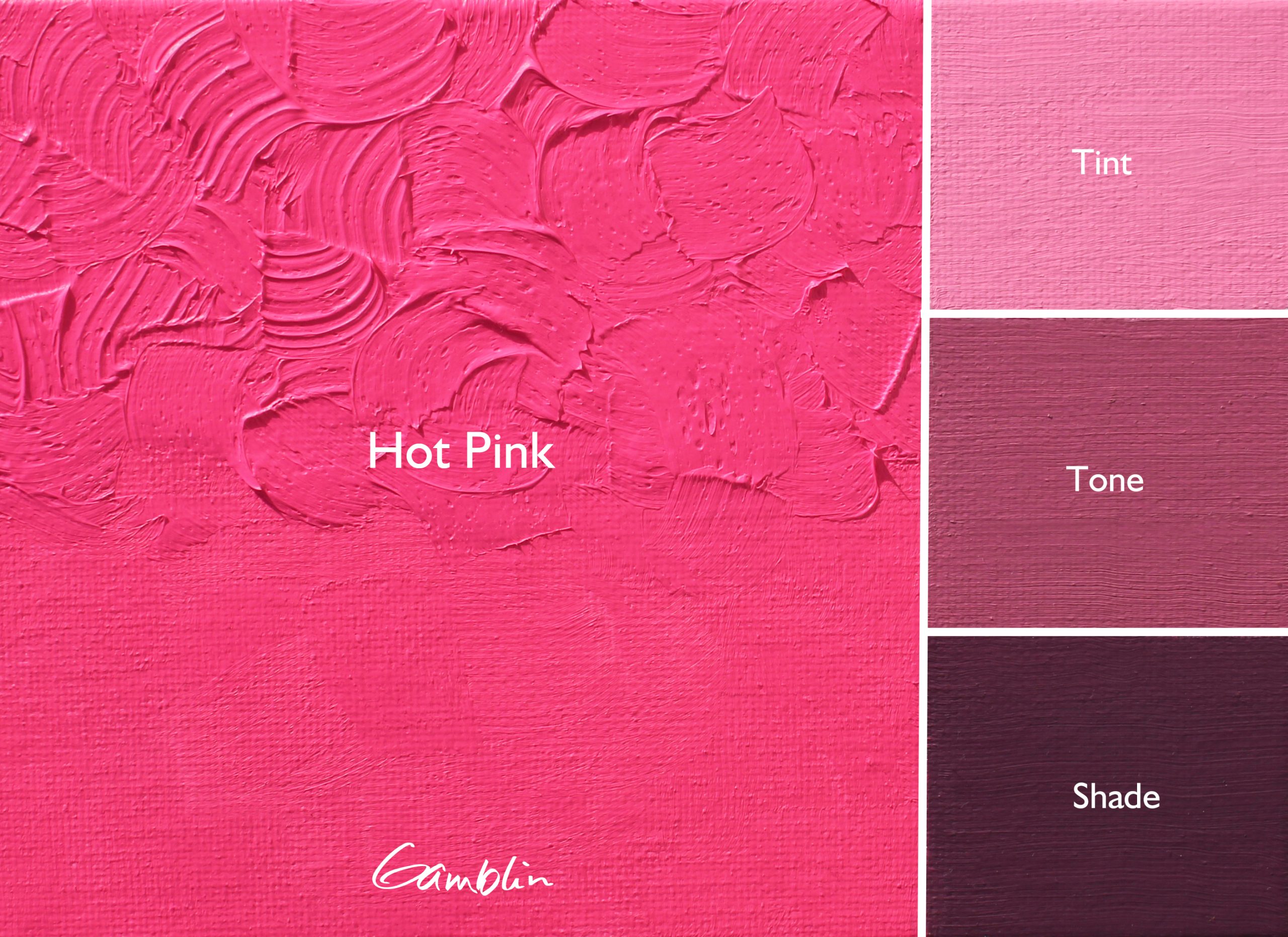
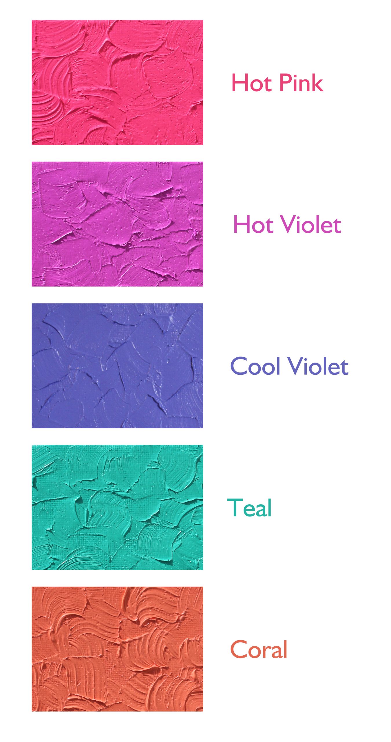
Hot Pink
Inspired by the Hot Pinks of the 1980s. Even more intense. Hands down the loudest color we’ve ever made. Barbie’s pale in comparison. Formulated with a Fluorescent Pink pigment for maximum pop. So bright our Master Paintmakers have to wear safety glasses with green lenses when they mix and mill it. Using specialty grade daylight fluorescent pigment, we were able to hit peak ‘80s Pop intensity with this one. Use the intensity to amplify colors within the red, blue, and violet hue families.
Pigment: PW6, N/A (Fluorescent Pink Pigment)
Vehicle: Alkali refined linseed oil
Lightfastness V *, Series 2, Opaque
Color Temperature: Warm
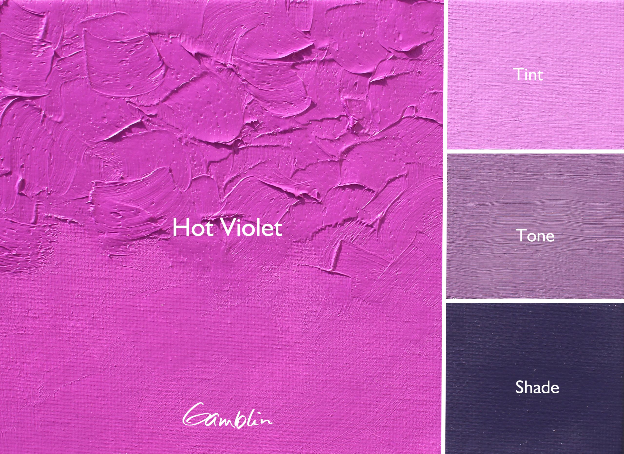
Hot Violet
In our range of oil colors, we have two warm violets and four cool violets. None of them bring the Miami heat like Hot Violet does. You can turn up the thermostat on cool blues and violets, or mix with Hot Pink to create a simmering, sultry Magenta. Like its pink counterpart, this fluorescent color brings a level of opacity and covering power unseen by other fluorescents and well beyond the quinacridone family of pigments.
Pigment: PW6, N/A (Fluorescent Violet Pigment)
Vehicle: Alkali refined linseed oil
Lightfastness V *, Series 2, Opaque
Color Temperature: Warm
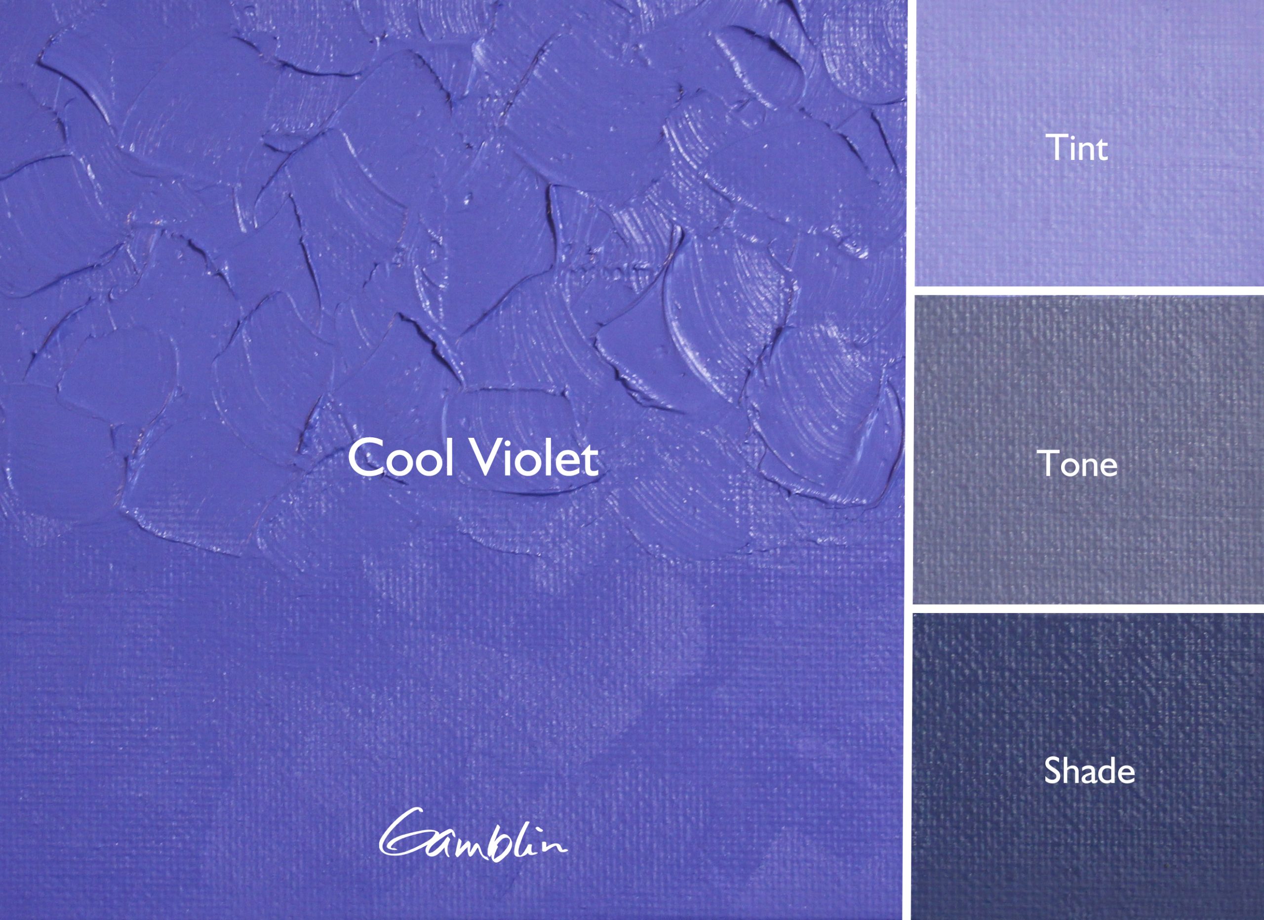
Cool Violet
We developed Cool Violet as a way of addressing a big gap in color space in the region of blue-violet. When you look at single-pigment violets—Cobalt, Ultramarine, Manganese, and Dioxazine—they’re all relatively close in color space. For our Cool Violet, we pushed Dioxazine Purple into blue-violet territory, moderated its overpowering strength, and gave it more opacity with the addition of Ultramarine Blue. Then we lightened it and brought out the blue-violet with Titanium White—placing it in color space at Munsell 10PB and filling a huge gap in the violets available to artists.
Pigment: PV23, PB29, PW6
Vehicle: Alkali refined linseed oil
Lightfastness I, Series 2, Opaque
Color Temperature: Cool
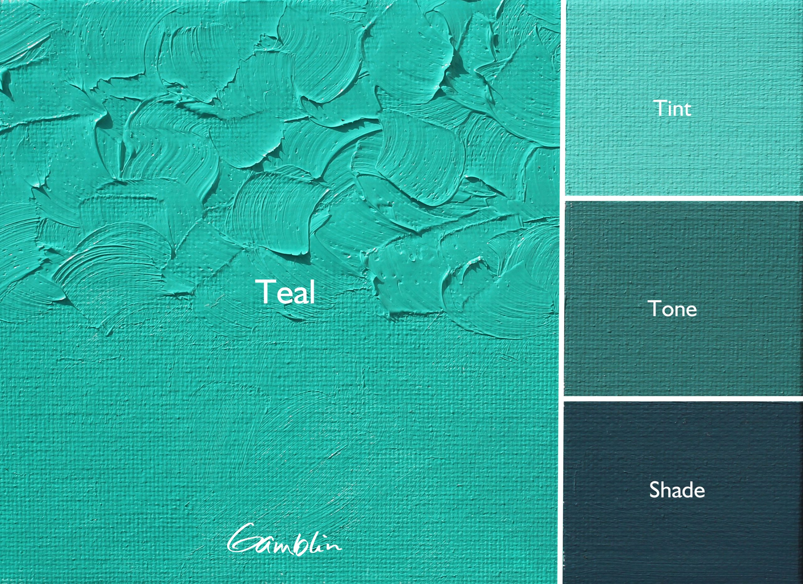
Teal
Teal is a throwback to the bold geometry and bright palette of the LA ‘84 Summer Olympic Games, and a companion to the Hot Pink and Hot Violet duo. We developed this color as a way to bring the brilliance of Artist Grade Radiant Turquoise and Green into the 1980 collection. Like the Radiant series, Teal is a high key tint composed of modern organic pigments, Phthalo Emerald and Phthalo Green.
Pigment: PG7, PG36, PW6
Vehicle: Alkali refined linseed oil
Lightfastness I, Series 2, Opaque
Color Temperature: Cool
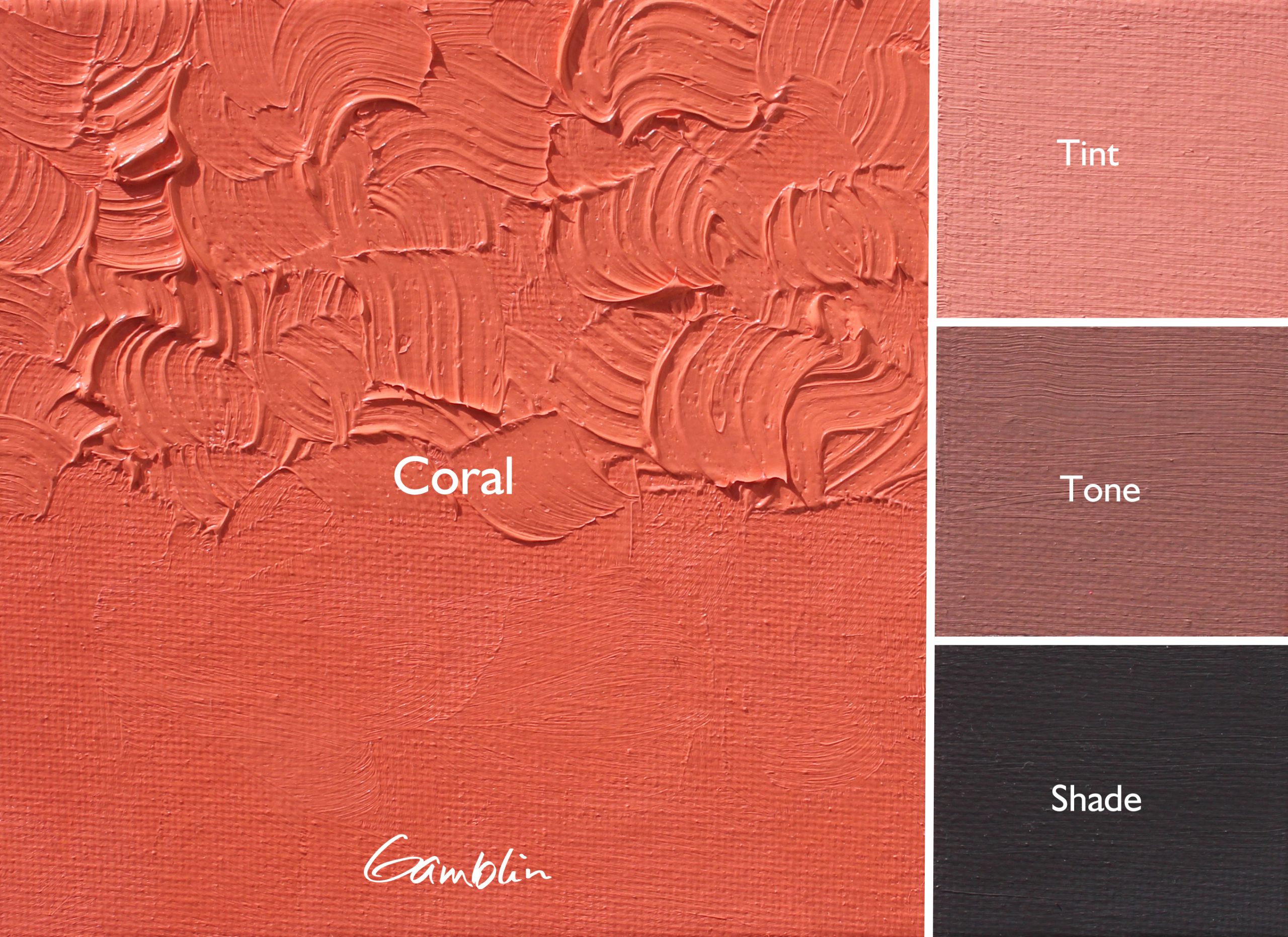
Coral
We felt that there are so many interpretations of what Coral can be, from red to orange shades and from deep to pale values. Our interpretation for 1980 Coral is a paler and gentler, leaning towards a sun-warmed, coral glow rather than full-tilt coral intensity of its Artists Grade counterpart.
Pigment: PO62, PR188, PW6
Vehicle: Alkali refined linseed oil
Lightfastness II, Series 2, Opaque
Color Temperature: Warm
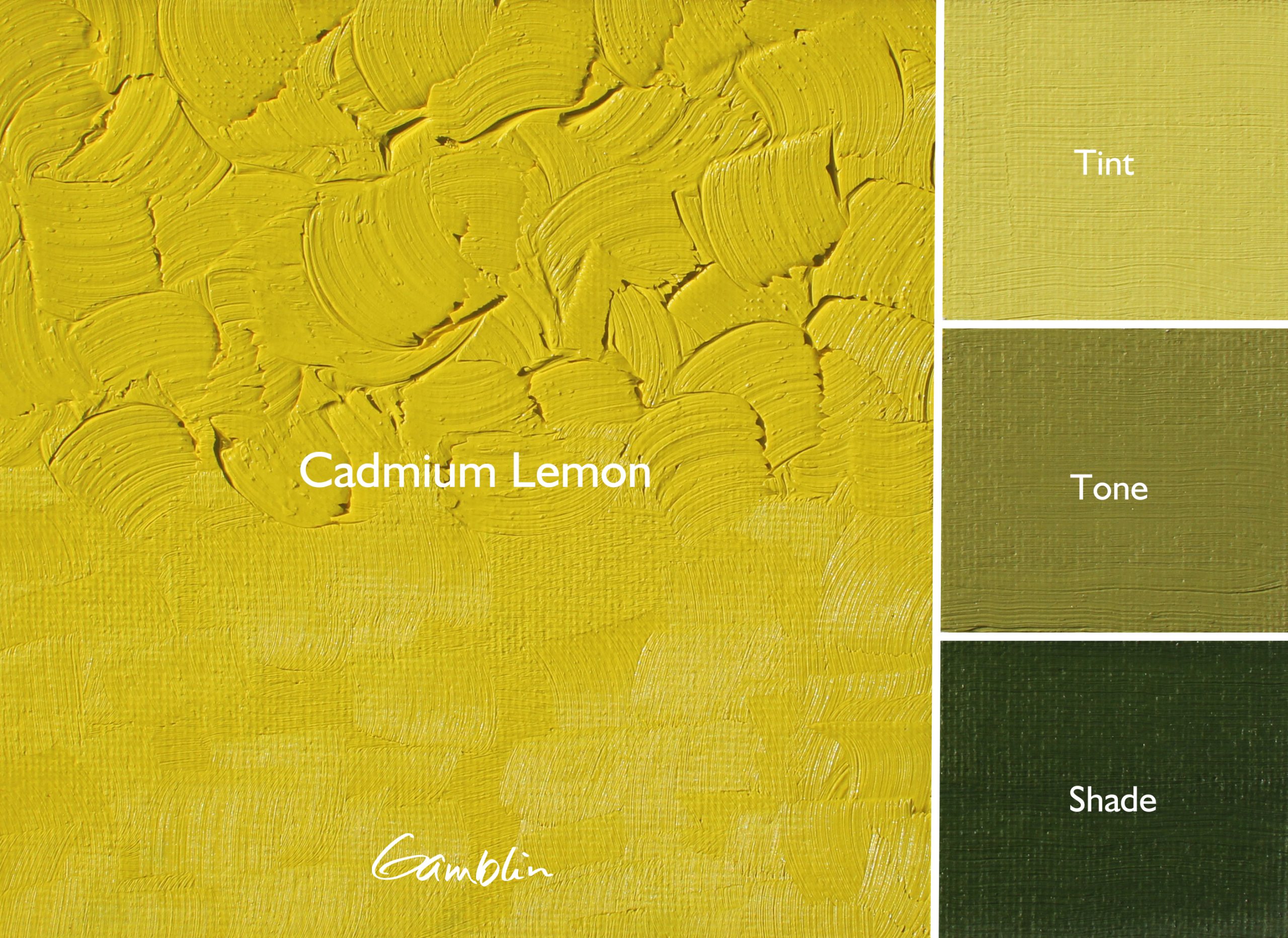
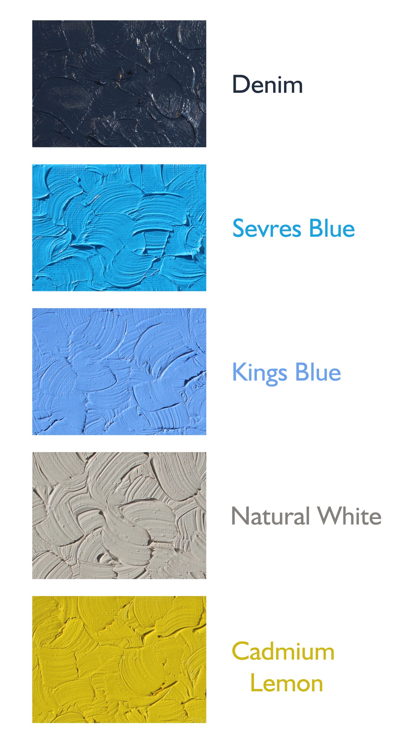
Cadmium Lemon
Cadmium Lemon is the coolest in temperature of our cadmium yellows. In comparison to our Artist Grade Cadmium Lemon, we chose to make Cadmium Lemon 1980 slightly cooler and paler.
Pigment: PY35, PY3
Vehicle: Alkali refined linseed oil
Lightfastness II, Series 3, Opaque
Color Temperature: Cool
Sevres Blue
1980 Sevres is a lighter, crisp blue compared to our Artist Grade formulation. In mixtures, Sevres can be used to amp up the intensity of Cerulean Blue. Great for depicting open skies, Sevres can be particularly useful towards the top of a composition, where the sky radiates deep rich blues, evoking the clarity and depth of the upper atmosphere.
Pigment: PB15:2, PB15:4, PW6
Vehicle: Alkali refined linseed oil
Lightfastness I, Series 2, Opaque
Color Temperature: Cool
Kings Blue
A traditional Kings Blue, indispensable for painting sky and water. Our 1980 formulation is lighter in value than our Artist Grade interpretation of this color. Warmer than our Radiant Blue and slightly deeper in value. Kings Blue brings out a warm rich tint, and was prized by royal families of 18th and 19th century Western Europe. Less violet and more opaque than blues formulated with smalt.
Pigment: PB29, PW6
Vehicle: Alkali refined linseed oil
Lightfastness I, Series 2, Opaque
Color Temperature: Warm
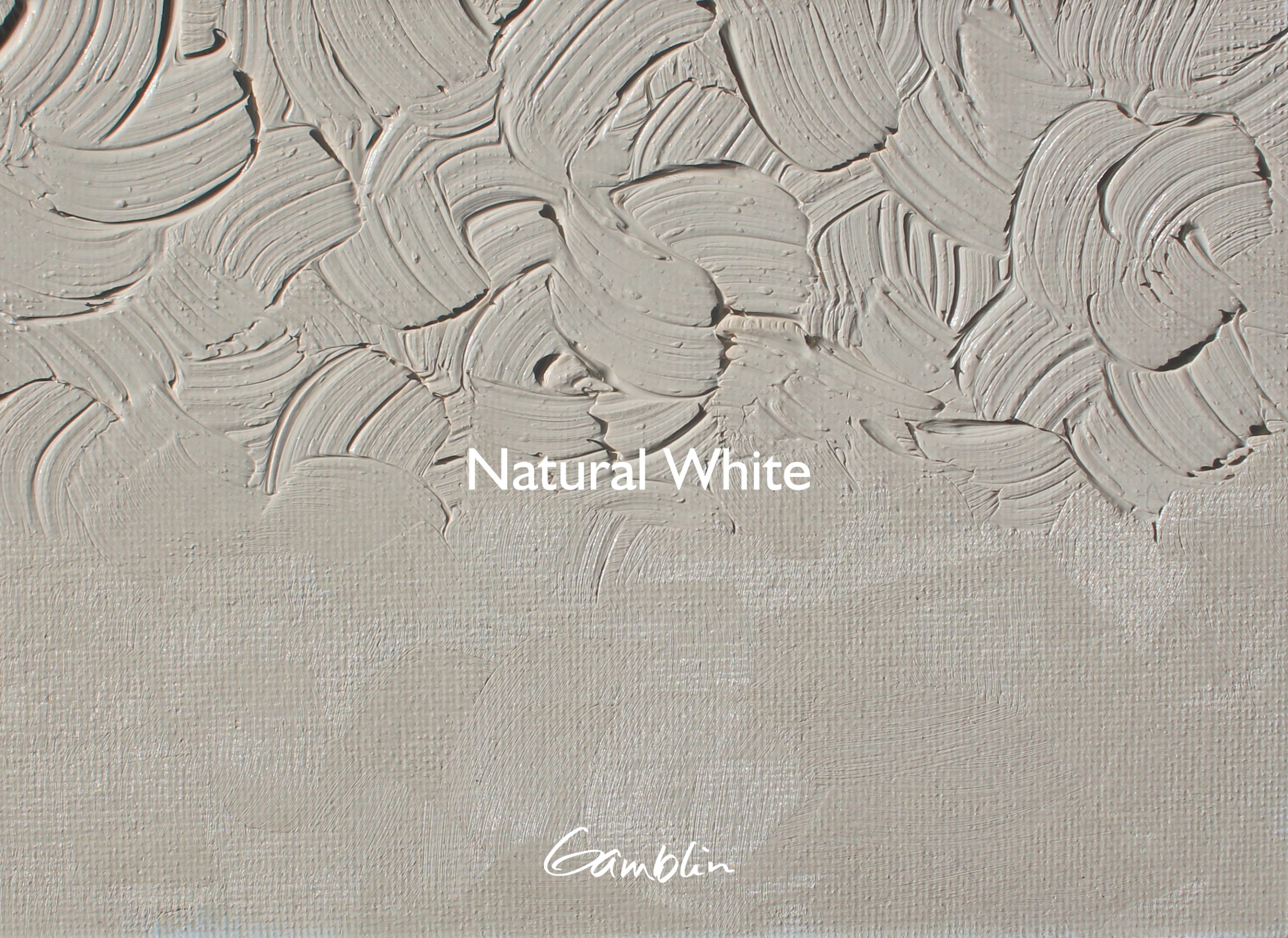
Natural White
Of all the whites in the natural world, very few are pure, perfectly neutral, gallery wall whites. With Natural White, our intention was to create the perfect white for mixing colors of the natural world. A truly useful tool for painting both people and places. Natural White is ideal for mixing the colors of birches, aspens, fields, prairie, and so on. Simply put, Natural White helps your mixtures get where you want them to be. More neutral and muted than the Warm White in our Artist Grade Range. Lighter, warmer, and less saturated than Titanium Buff.
Color Temperature: Warm
Pigments: PBr7, PW6
Binder: Safflower Oil
Lightfastness: I
Opaque
Series 1
Denim
Indigo and Denim Blue were developed for our AG and 1980 palette, drawing inspiration from the timeless character of mid-century selvedge denim workwear and British Royal Airforce blues. Denim Blue 1980 is a versatile, muted blue with a subtle indigo undertone. We liked one of Indigo’s tints so much that we decided it deserved its own place on the rack, and what better way to introduce Indigo to the 1980 line than with a lighter version of the color.
Pigment: PB15:2, PV15, PBr7, PW6
Vehicle: Alkali refined linseed oil
Lightfastness I, Series 2, Semi-transparent
Color Temperature: Warm
Natural White
Of all the whites in the natural world, very few are pure, perfectly neutral, gallery wall whites. With Natural White, our intention was to create the perfect white for mixing colors of the natural world. A truly useful tool for painting both people and places. Natural White is ideal for mixing the colors of birches, aspens, fields, prairie, and so on. Simply put, Natural White helps your mixtures get where you want them to be. More neutral and muted than the Warm White in our Artist Grade Range. Lighter, warmer, and less saturated than Titanium Buff.
Pigment: PBr7, PW6
Vehicle: Safflower oil
Lightfastness I, Series 1, Opaque
Color Temperature: Warm
Denim
Indigo and Denim Blue were developed for our AG and 1980 palette, drawing inspiration from the timeless character of mid-century selvedge denim workwear and British Royal Airforce blues. Denim Blue 1980 is a versatile, muted blue with a subtle indigo undertone. We liked one of Indigo’s tints so much that we decided it deserved its own place on the rack, and what better way to introduce Indigo to the 1980 line than with a lighter version of the color.
Pigment: PB15:2, PV15, PBr7, PW6
Vehicle: Alkali refined linseed oil
Lightfastness I, Series 2, Semi-transparent
Color Temperature: Warm

Fast Dry Titanium White, now in 1980
1980 Fast Dry Titanium White retains the working properties of our traditional 1980 Titanium White, but will dry a day or two quicker by comparison. It dries in 24 to 48 hours, which is about 12 hours behind the dry-time of our Artist Grade Fast Dry Titanium White and twice as fast-drying as traditional 1980 Titanium White. The fast drying rate means painters can stay in the flow of their painting session longer with layering and mark-making possibilities beyond traditional Titanium White. If your white isn’t keeping up with the flow of your painting, Fast Dry Titanium White was designed with you in mind.
Pigment: PW6
Vehicle: Safflower oil
Lightfastness I, Series 1, Opaque
Color Temperature: Neutral
The trail doesn’t end here
We began this chapter in color development several years ago, and we are nowhere near finished. We have more colors on the way that solve real problems for painters and create meaningful, new possibilities.
Subscribe to our email newsletter to stay informed and be sure to follow our social media to see these new colors put to work.

