Gamblin Greys
This page explores the center of the color wheel with our three, neutral Portland Greys and our three colored greys, Titanium Buff, Portland Warm Grey, and Portland Cool Grey.
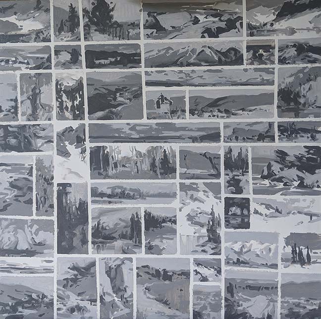
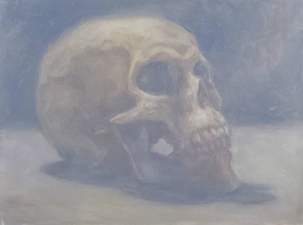
Portland Grey Value Studies by Ellie Wilson
Neutral Greys: Portland Grey Light, Portland Grey Medium, and Portland Grey Deep
The grey skies of our fair city inspired Robert Gamblin to formulate three Portland Greys – Light, Medium, and Deep. These three neutral greys were developed to help painters quickly adjust the value and chroma of colors.
Munsell Values
Portland Grey Deep, Medium, and Light are formulated at Munsell values 4, 6, and 8, respectively.


How are Portland neutral greys useful?
Out of the tube, these three values of grey can effectively be used to create preliminary value studies. Simplifying subject matter down to three values is an excellent way to organize complex compositions down to larger shapes, as illustrated in the work below by California artist Ellie Wilson.
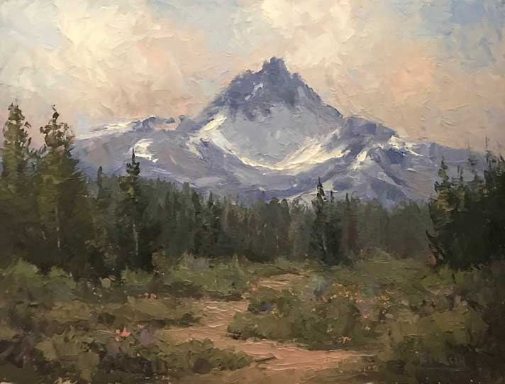
Wilson explains, “The Portland Greys were used to create two close-up thumbnails in preparation for my painting Ibantik Lake. The Portland Greys are a key step for my process of creating a studio painting.”


Ellie Wilson, Ibantik Lake, oil, 12″ x 16″
Color mixing with Portland neutral greys
In color mixing, these neutral greys give painters the ability to simultaneously adjust value and reduce the intensity of brighter colors for more natural color mixtures.
The inner circles of the color wheels below show the mixing effects of Portland Grey Light, Medium and Deep on a palette of Cadmium Yellow Medium, Cadmium Orange, Alizarin Permanent, Dioxazine Purple, Ultramarine Blue, and Sap Green.
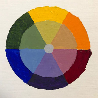
Colors mixed with Portland Grey Light
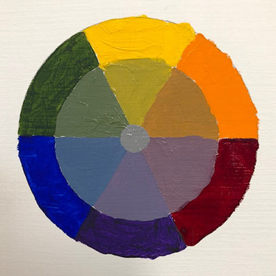
Colors mixed with Portland Grey Medium
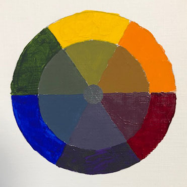
Colors mixed with Portland Grey Deep
Another tip for creating harmony in color mixing: consider using Portland Grey Light in place of white for low-light painting situations.
Colored Greys: Portland Warm Grey and Portland Cool Grey
We expanded our range of Portland Greys to include Portland Warm Grey and Portland Cool Grey, which tilt toward red and blue, respectively. With Titanium Buff added as a yellow-grey, we created a triad of muted primary colors. From these three muted primaries, we can mix a range of muted secondaries.
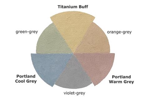
Formulated to work together, these colors give painters a range of colored greys for nuanced color mixing. Having a complete range of primary and secondary colored greys can be incredibly valuable for figurative and landscape painting. The compressed value range of these colors is helpful in creating atmospheric effects in paintings.
Artist examples | Putting Gamblin colored greys to work
Mitch Albala
The Portland Greys work to neutralize brighter, purer colors in my palette to create a sense of color harmony and atmosphere in my work. This harmonized, tonal approach to color is evident in my waterfall paintings where the subtle shifts in temperature and hue are dictated by the unifying use of grey. Colors that might be too dissimilar or discordant in a brighter or more saturated color painting, are calmed down and better able to agree with each other when they are neutralized.
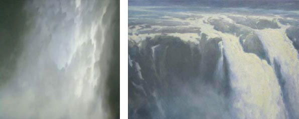
Mitch Albala, left: Veil Falls, oil on canvas, 30” x 30”, right: August Falls, oil on canvas, 26” x 36”
Paul Batch
Portland Warm Gray is my favorite mid-value color out of the tube. I use it all over the place. It’s earned a home on my palette because of its versatility and ease of use
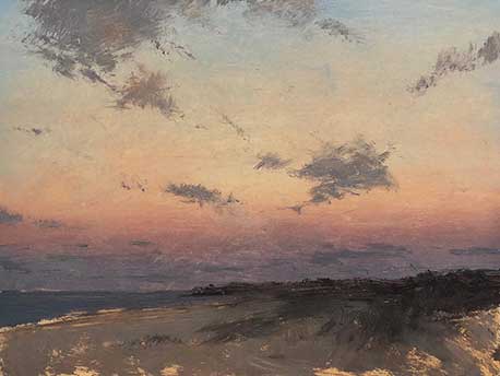
Paul Batch, Land’s End, Oil on Panel, 6” x 8”
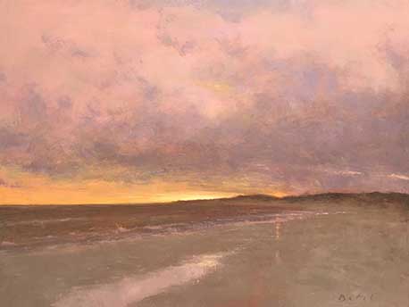
Paul Batch, Day’s Close, Oil on Panel, 18” x 24”.
Kristina Carroll
The soft atmosphere made possible by painting with the Colored Greys and a little Titanium Zinc White is beautiful. I find exploring the subtle shifts in temperature quite a peaceful and meditative process. These colors work so wonderfully on their own but add lovely complexities to my figurative work as well. Apart from white, the Colored Greys are amongst my most used colors.
Kristina Carroll, Remain, oil on panel, 6” x 8”
Randall Tillery
Portland Warm Grey is a staple on my palette for my Plein Air painting. I find that having this color on my palette allows me more painting time and less mixing time…which is important while Plein Air painting. I love the subtle warmth that Portland Warm Grey provides and use it a lot in my cloud shadows. It’s also used throughout the painting especially with seascapes or snow scenes where the water/snow is influenced so much by the sky. I very rarely use it straight out of the tube but instead use it as a base to warm or cool down as I need.
Randall Tillery, Three Finger’s Magic, oil, 9” x 12″
Take me back to the Experience Color menu