Mineral pigments have long been a staple for artists looking to capture the moment in painting from life. When we study a landscape or the subject of a portrait, we find a set of subtle hues that render the majority of what we experience visually.
We also find that bold colors not softened by light or atmospheric interference are rare, and it’s in these rare exceptions that colors composed of modern pigments can be particularly useful. Consider the fiery oranges at sunrise or sunset, the spectacle of color in a coral reef, or the floral drama of peony petals in full bloom. These are instances where nature’s palette portrays life in full chroma—and for painters looking to capture that intensity, they’ll need a modern approach.
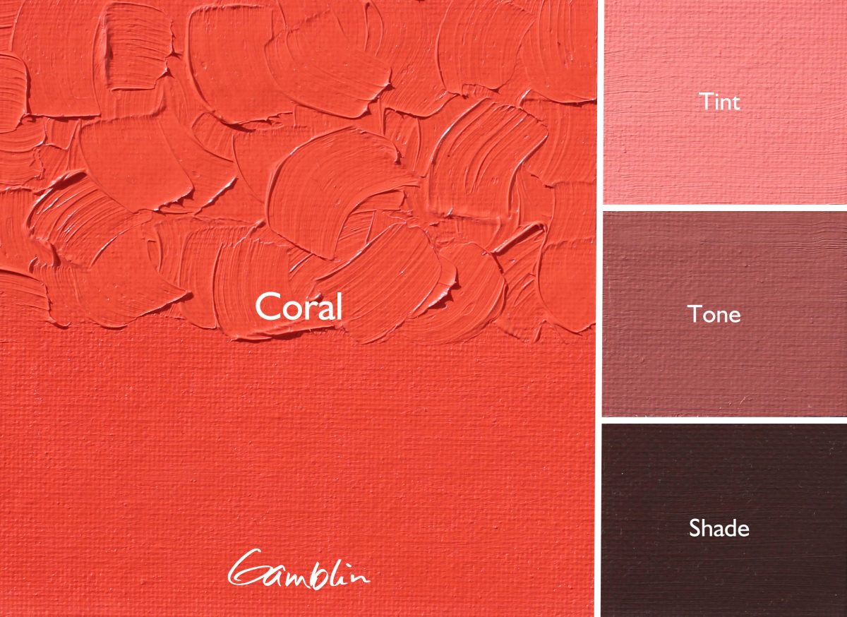
Our Artist Grade Coral skirts the boundary between red and orange hue families. For our 1980 range, rather than replicating the flagship series color with reduced pigment load, we chose to offer a different shade of Coral, by only reducing the concentration of one of its pigments rather than making a reduction across the board. We felt that there are so many interpretations of what Coral can be, from red to orange shades and from deep to pale values. Our interpretation of Coral in Artist Grade is deeper and bolder. Our interpretation for Coral 1980 is a paler and gentler interpretation, leaning towards a sun-warmed, coral glow rather than full-tilt coral intensity.
Pigment: PO62, PR188, PW6
Vehicle: Alkali refined linseed oil
Lightfastness II, Series 2, Opaque
Color Temperature: Warm